GoPrep Gradebook: AI, Information, and Education transformation
Transforming Educational Analytics Through Intelligent Design
This case study documents the complete redesign of GoPrep's instructor-gradebook system, transforming it from a basic grade-tracking tool into a comprehensive performance intelligence hub. The project involved in-depth user research with over 20 educators, strategic design thinking to balance complexity with usability, and the integration of AI-powered insights that fundamentally changed how instructors understand and act on student performance data.
Role:
Senior Product Designer
Duration:
4 Month
Outcome:
73% reduction in time instructors spend analyzing student performance
89% instructor satisfaction rate (up from 34%)
4.2x increase in early intervention for at-risk students
Team:
1 UX Designer
Dev Team
Reporting to: Product manager,CTO

Part 1: Discovery & Problem Definition
The Initial Challenge
GoPrep's gradebook had the lowest user satisfaction rating (2.1/5) on the entire platform. Instructors spent 4-7 hours weekly exporting data to Excel just to answer basic questions about their students. Despite accurate grade calculations, the gradebook failed to provide the insights instructors actually needed.
"I spend more time analyzing spreadsheets than actually helping students."
— Frustrated instructor during contextual inquiry
The Real problem
High school and university instructors manage 60-150 students across multiple sections. They need to identify struggling students early, evaluate teaching effectiveness, and prioritize their limited time—but current tools only show grades, not insights.
Business impact:
Gradebook frustration was appearing in user feedback and risked our growth with new institutional partners. As a growing startup, we needed this feature to become a strength, not a weakness.
How is the problem currently being addressed?
What are competitors doing?
I analyzed 6 major LMS platforms (Canvas, Blackboard, Moodle, Google Classroom, Schoology, Brightspace) to understand the current landscape.
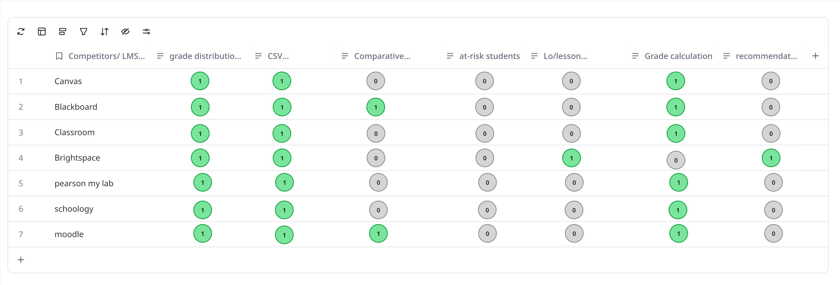
What competitors offered:
✓ Basic grade calculation
✓ Simple grade distribution charts
✓ Export to CSV functionality
What competitors missed:
✗ Predictive insights for at-risk students
✗ Comparative analytics across sections/semesters
✗ Actionable recommendations
✗ Learning objective performance tracking
The opportunity: Build the first truly intelligent gradebook that answers instructor questions before they have to export to Excel. This could be GoPrep's differentiator in a crowded market.
How are instructors currently solving this problem?
Contextual inquiry with 10 instructors
I spent 3-4 hours with each instructor during their actual grading workflows. I watched them export data, create manual pivot tables, print gradebooks, and use highlighters to identify patterns.

[Due to sensitive information, I cannot provide real images of the session]
Expected Outcome
Identify what motivates them to seek solutions
Uncover what prevents them from achieving goals
Map their mental models for performance analysis
Understand how instructors support student learning
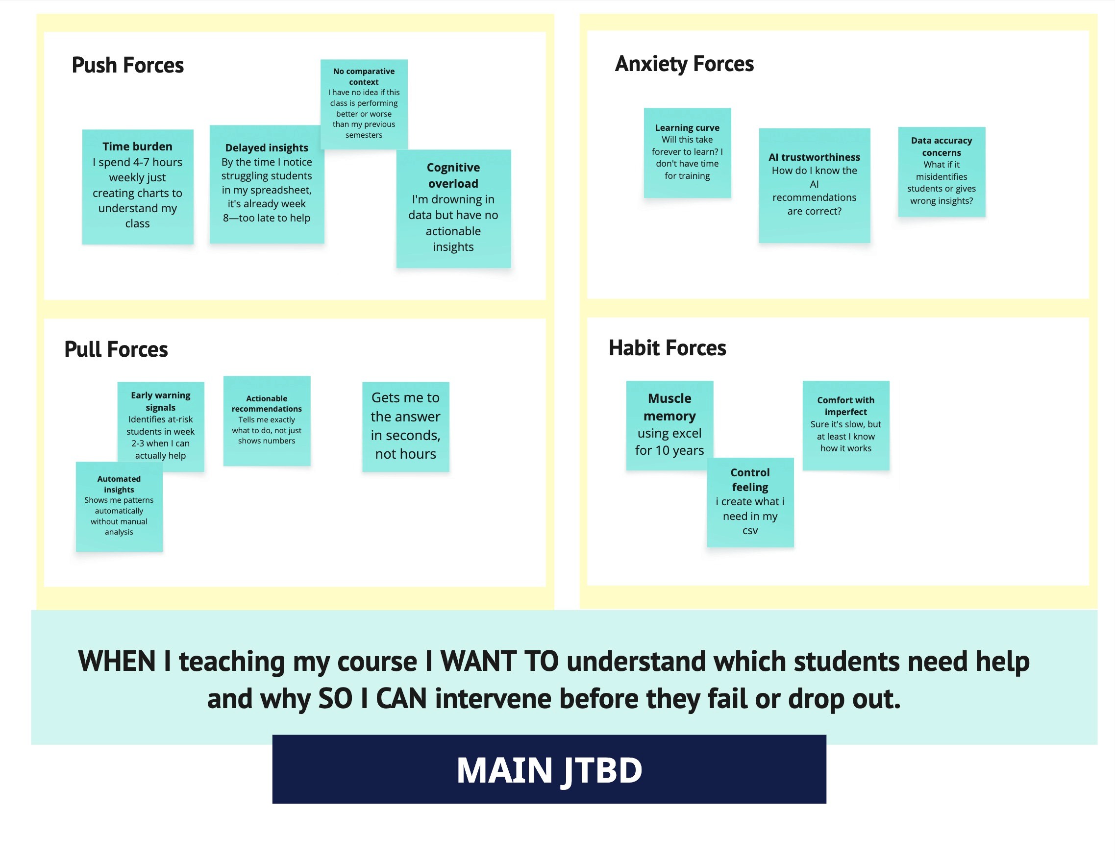
One instructor told me: "I don't need better grades—I need to know which students to call before they drop the course." This reframed the entire project. This wasn't about grades. It was about enabling proactive teaching decisions.
Focusing on the WHY, not the What
In-depth interviews: 30 instructors across 8 institutions
I used the Jobs-to-Be-Done framework to understand:
What "progress" looks like in their work
What forces drive them to seek solutions
What anxieties prevent behavior change
What outcomes they hope to achieve
Identifying User Insights
After interviewing 2 additional instructors and re-doing the affinity map, patterns emerged naturally. I identified 3 overarching insights:
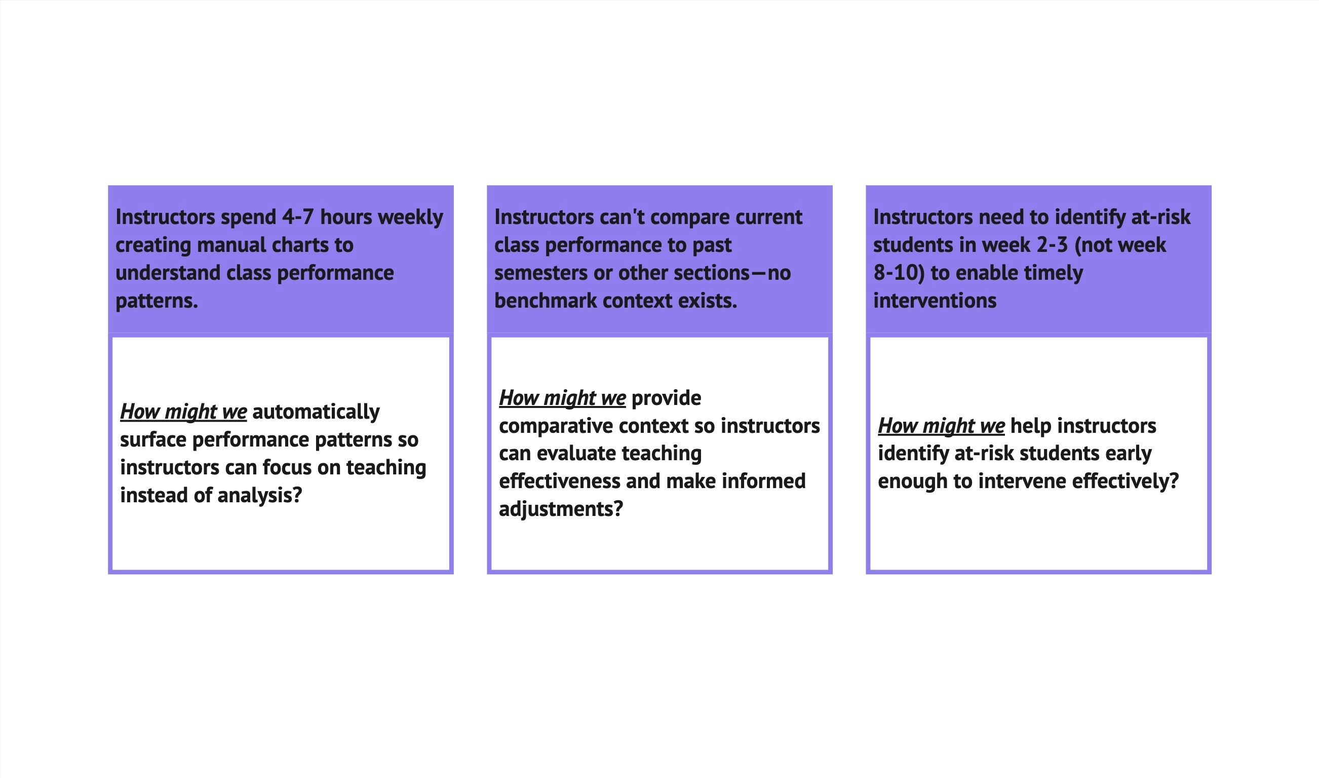
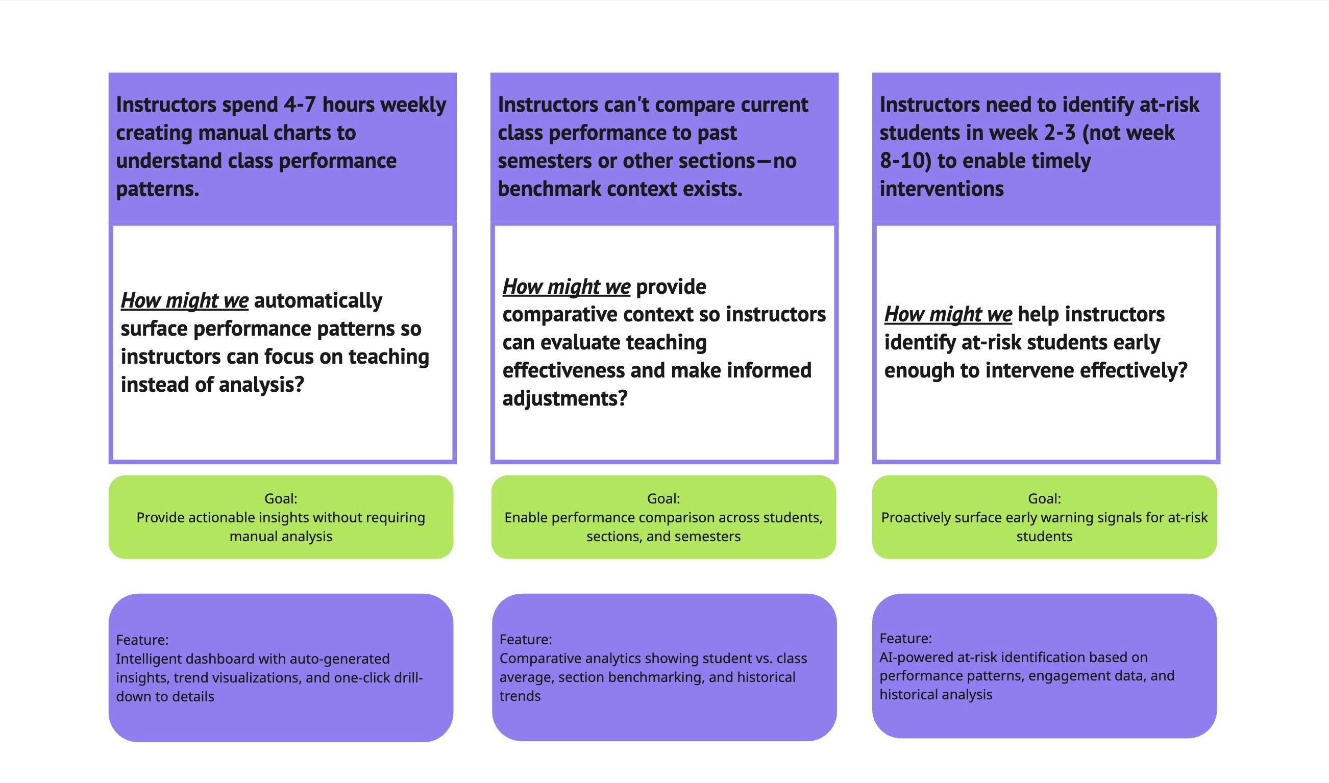
Every instructor needed to answer three core questions
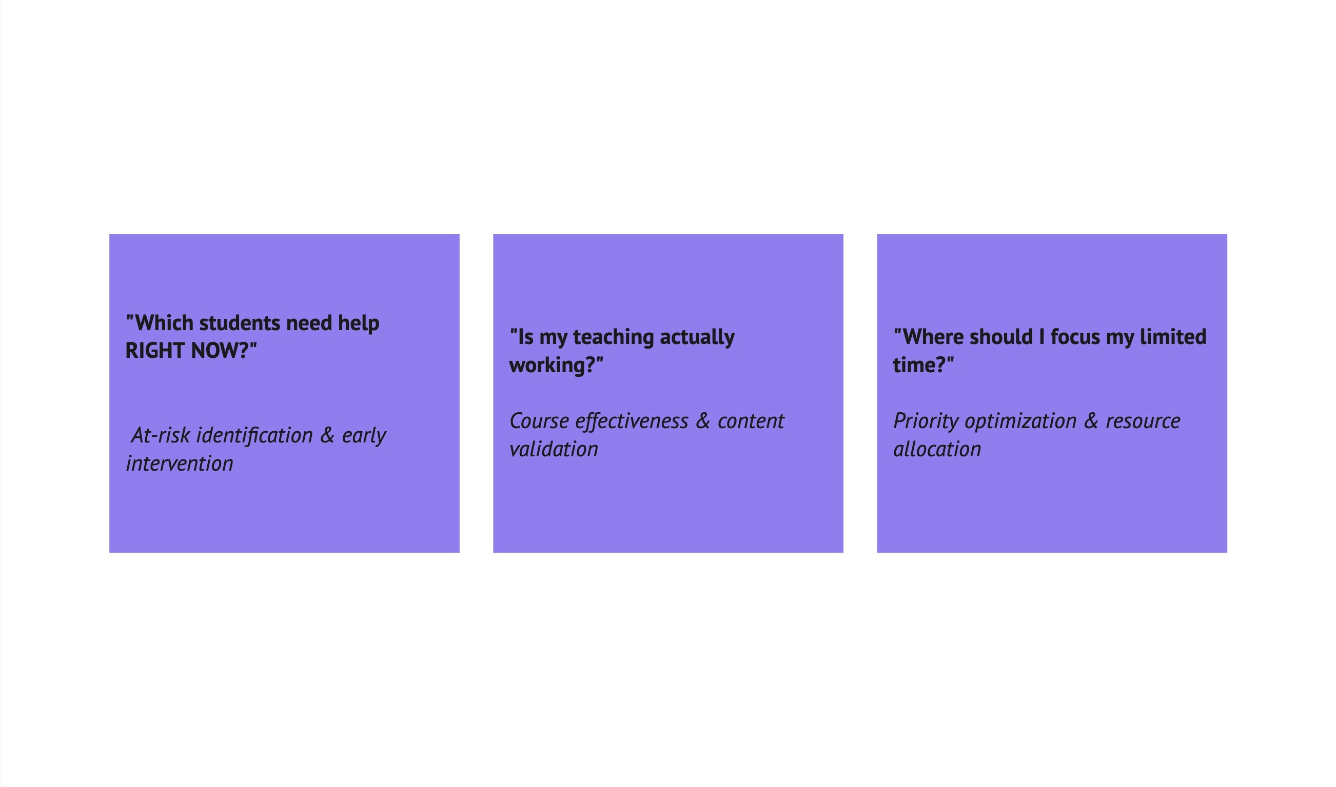
After synthesizing 45+ hours of research, I discovered that every instructor—regardless of experience, subject, or institution—struggled with the same three questions:
"Which students need help RIGHT NOW?" → At-risk identification & early intervention
"Is my teaching actually working?" → Course effectiveness & content validation
"Where should I focus my limited time?" → Priority optimization & resource allocation
This became our design north star: Every feature, every visualization, every AI insight would serve one of these three questions
Part 2: Define
Insights into HMWs
Brainstorming solutions with constraints
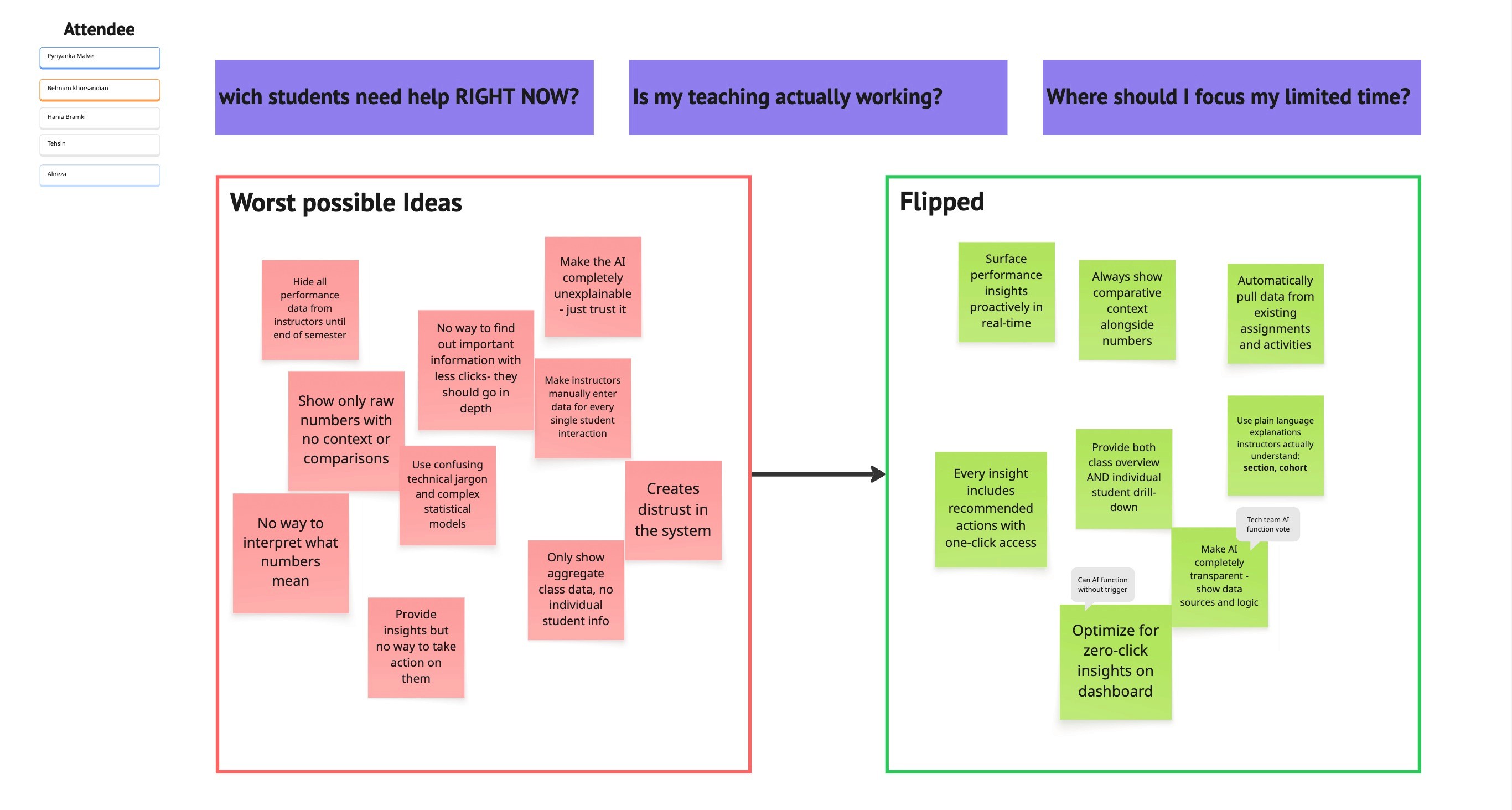
Using the HMWs, I started brainstorming solution ideas. But I found that my analytical thinking limited creative exploration.
Method 1: Playing with opposites
I brainstormed the worst possible solutions. What would be the opposite of a solution? Then flipped the bad ideas into possible good ideas.
Method 2: Creative constraints
Used a list of constraints requiring ideas for scenarios like:
Must work without an internet connection
Must feel like a game
Must work in 30 seconds
Aligning the solution to the research
Initial solution idea (too ambitious for a startup)
AI-powered analytics dashboard with predictive modeling, automated interventions, cross-semester comparisons, and real-time collaboration tools.
Problem: This addressed everything, but was too complex to build in 4 months with our small team. As a startup, we needed to focus on core values first.
Revised solution idea (focused on MVP):
An analytics dashboard that automatically answers the 3 core questions by surfacing insights, providing comparative context, and offering AI-powered recommendations for action.
Validation: Shared at design critique. Team confirmed this directly addressed research insights within our technical constraints and timeline.
HMWs to Product Goals
Part 3: Design
How should we organize information?
I needed to understand how instructors think about performance data to design an intuitive information architecture.
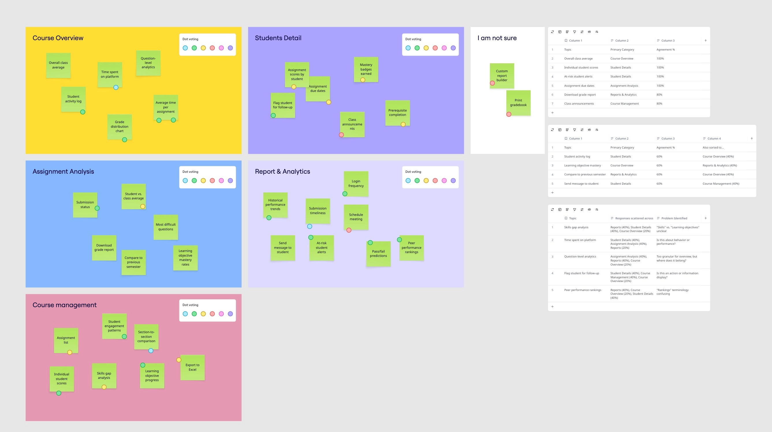
Card sorting with 5 instructors
Conducted remote closed card sort via OptimalSort:
5 categories, 35 topics
5 participants (4 instructors, 1 department head/ former dean )
Key finding:
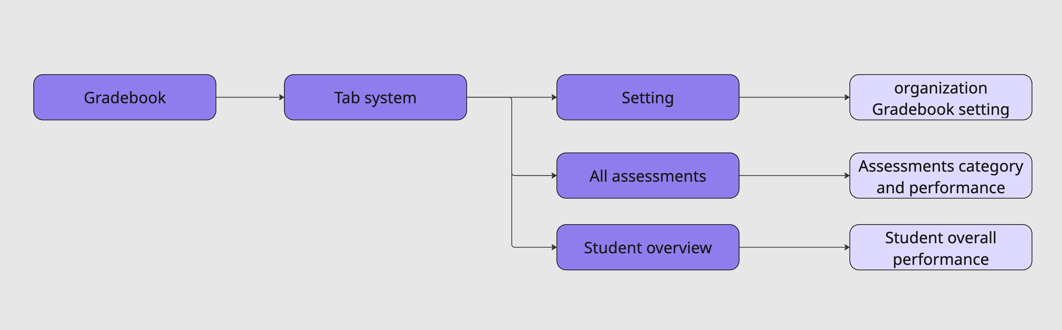
Information should be presented from top to bottom —> course, section, students, assignemnts, assignment performance
should keep the integrity of the GradeBook( Instructors should be able to stay in the gradebook section instead of being redirected to other sections
Impact: This highlighted the need for a clear Path throughout the entire design process, and also, UX copy became an ongoing iteration priority( keep the information resonant)
Getting to the goal with fewer clicks
Round 1: MVP mindset
Eliminated features not necessary to meet product goals.
Round 2: Fewer clicks to goals
Minimized clicks to reach key features.
Final IA: Three-tier information model
Design rationale: The 80/15/5 split reflected actual usage patterns from research. Optimize for speed while enabling depth when needed.
Mapping complex flows
I worked through task flows and user flows, asking:
What would users be looking at?
Where are the decision points?
What are error paths?
How can we help users avoid or recover from errors?
Iterating to find the best approach
Three concepts explored
Concept A: "Dashboard Command Center"
Single-page dashboard, everything visible
✓ Fast for experienced users
✗ Overwhelming for new users
Concept B: "Guided Analysis Workflow"
Step-by-step wizard through analysis
✓ Easy for beginners
✗ Too slow for quick checks
Concept C: "Intelligent Layers" ← SELECTED
Summary view with progressive disclosure
✓ Supports both quick checks and deep dives
✓ AI insights integrated contextually
✓ Grows with user expertise
Concept validation
Tested all three with 12 instructors using the think-aloud protocol.
Results:
10/12 instructors preferred Concept C
"Gives me what I need fast but doesn't hide the details"
"AI suggestions feel helpful, not intrusive"
Key refinement needed:
Instructors wanted control over default metrics display. Added customization to the roadmap.
Data visualization challenge
How do we make complex data instantly comprehensible?
Created a comprehensive visualization library with strict design principles.
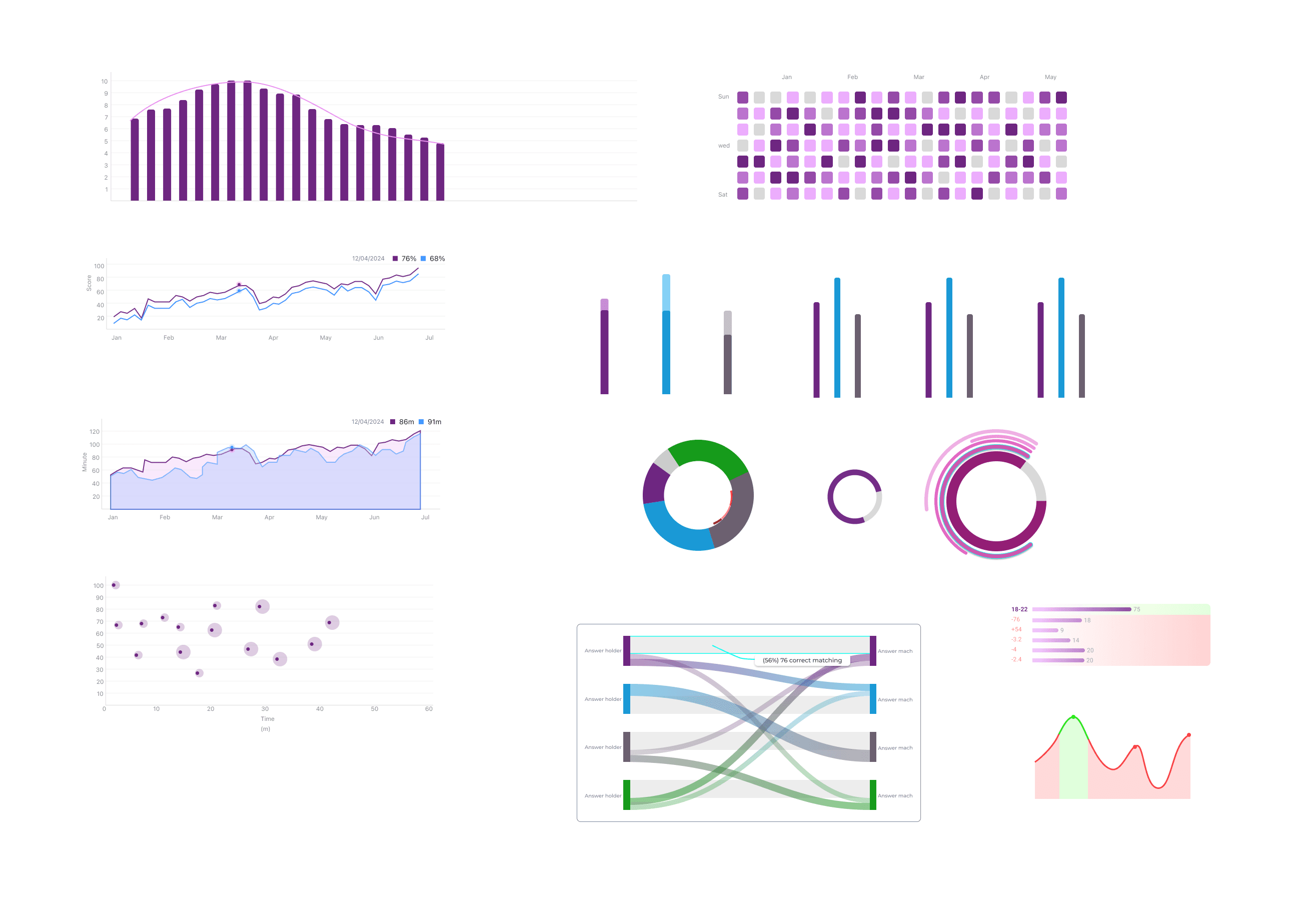
Visualization principles established
1. Every chart tells a story
✗ Bad: "Assignment Score Distribution"
✓ Good: "Assignment 3 was significantly harder—40% scored below 70%"
2. Progressive detail through interaction
Default: Show the insight
Hover: Reveal specific data
Click: Navigate to detailed analysis
3. Comparative context always visible
Student vs. section average
Section vs. class average
Current vs. historical baseline
4. Accessible by default
Color-blind safe palettes
Text labels supplement color
WCAG 2.1 AA compliant
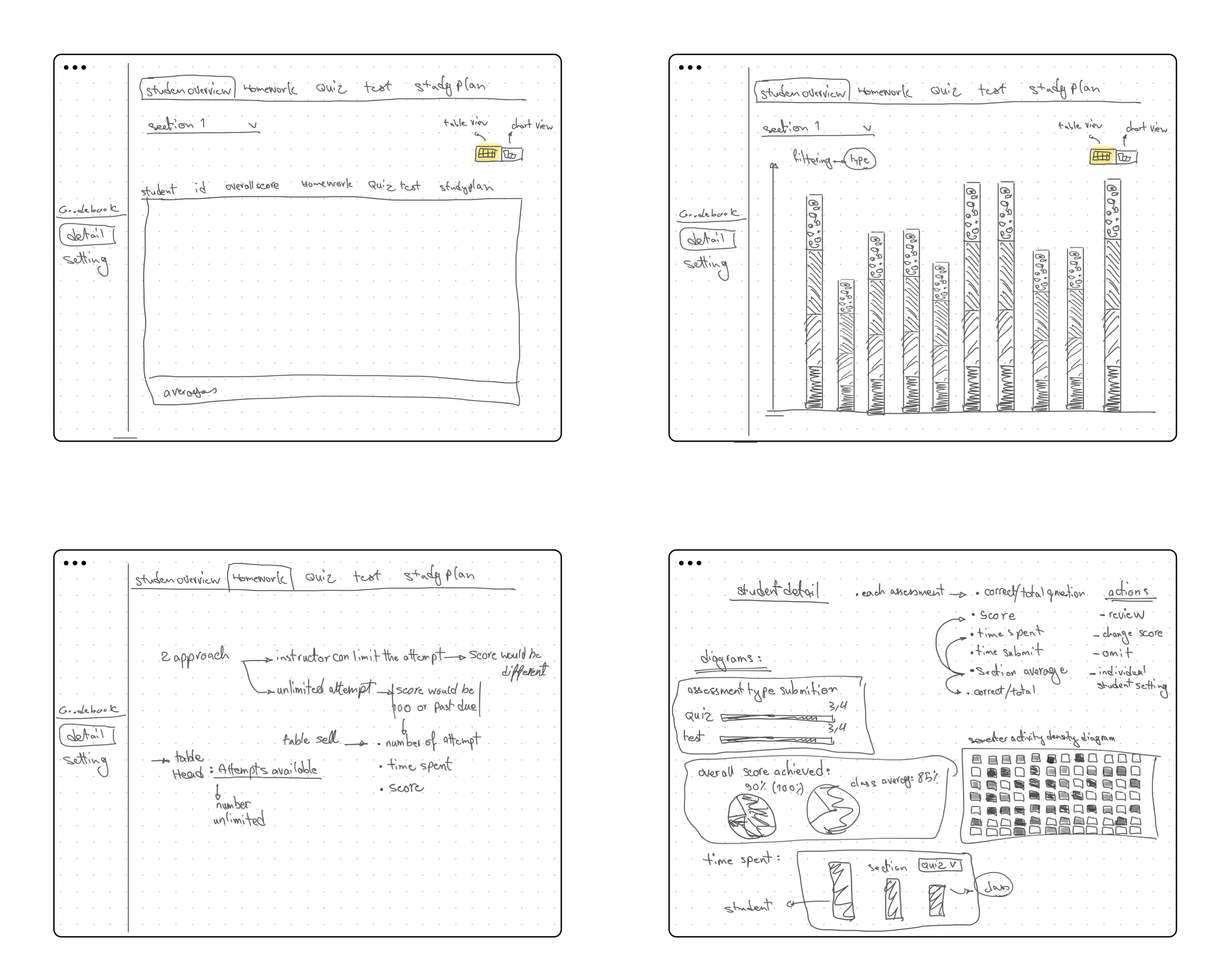
Key visualizations designed
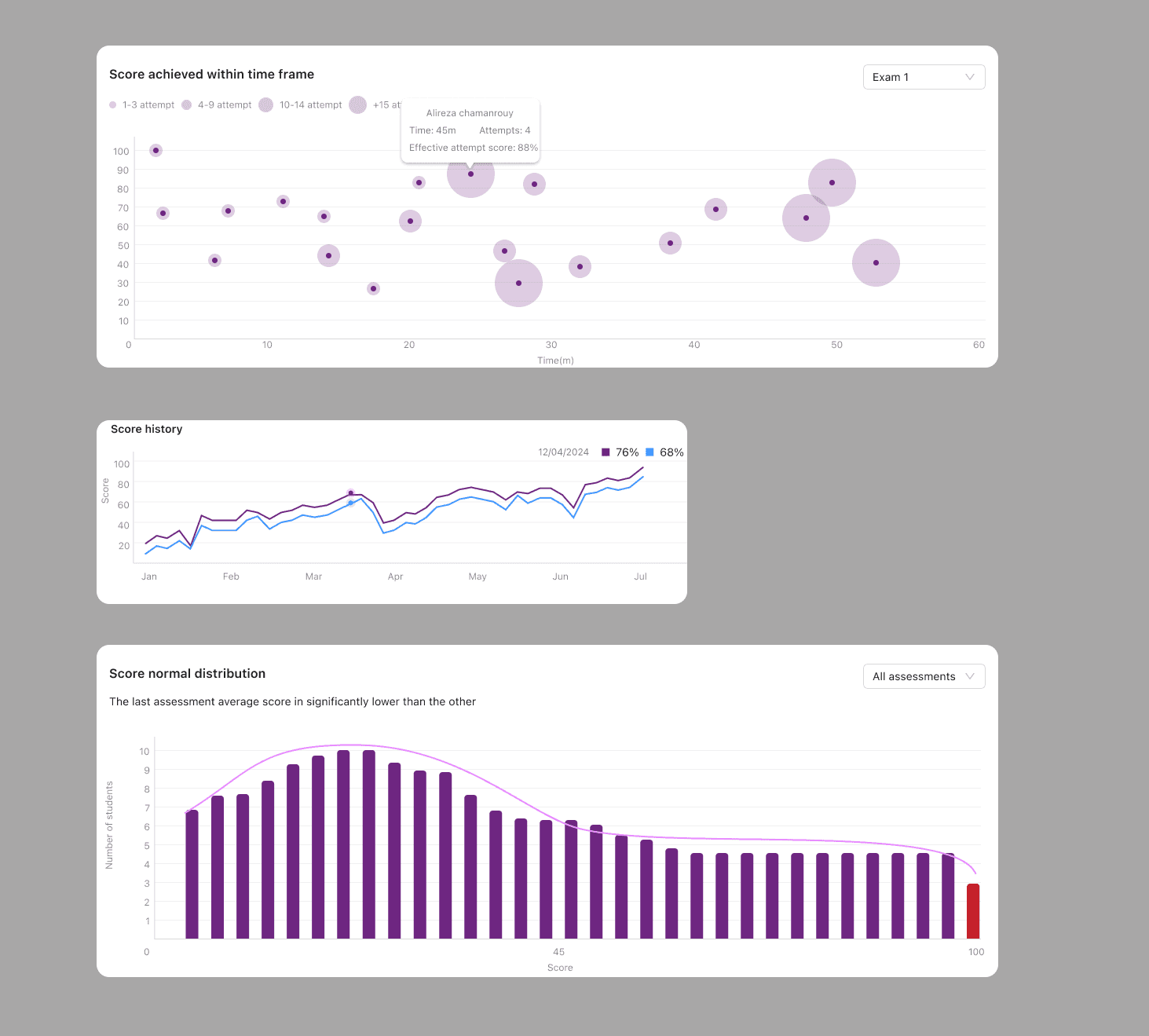
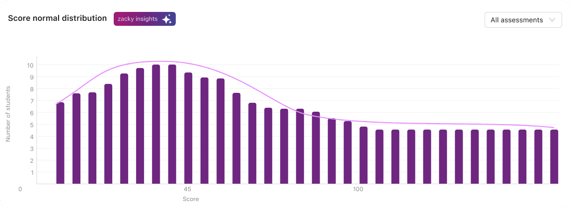
Performance Distribution Histogram
Shows a normal curve with outlier detection
Design decision: Used area chart instead of bars for clearer "bell curve" recognition. Interactive: click any area to see students in that range.
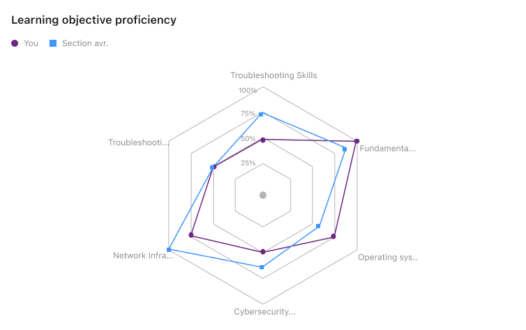
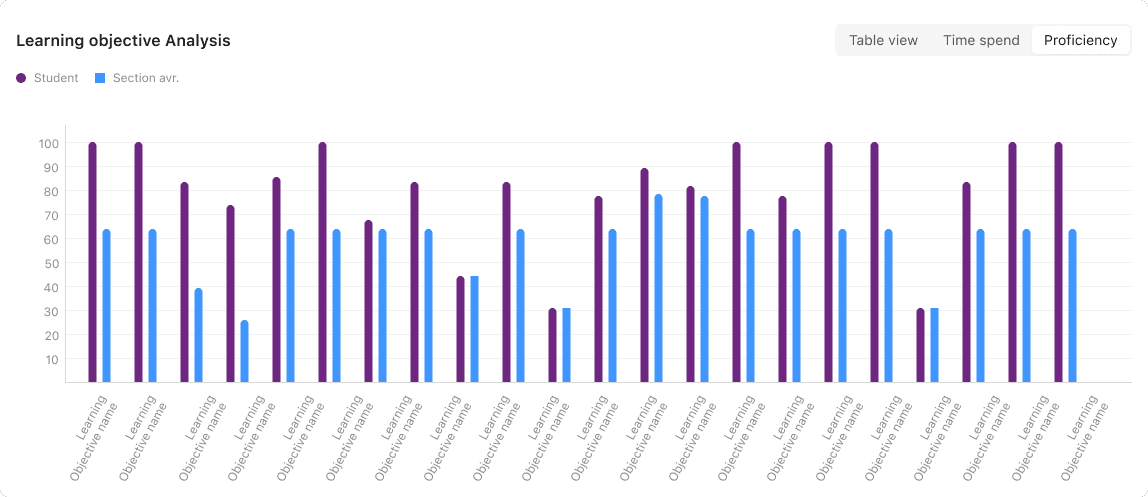
Learning Objective Mastery Matrix
Dual bar chart comparing student vs. section average
Design decision: Sorted by performance gap (biggest struggles first) rather than LO number. Color-coded only when gaps exceed ±10%.
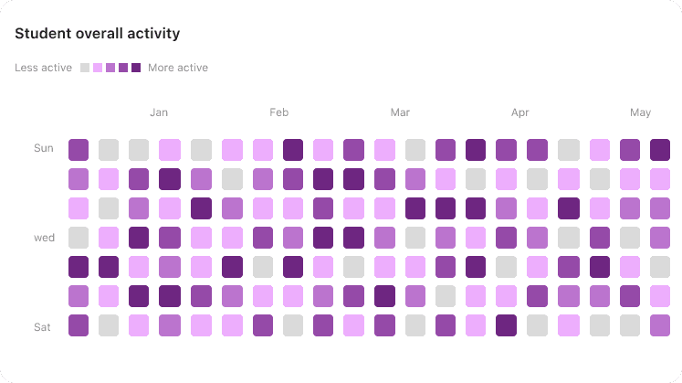
Activity Engagement Heatmap
Calendar view showing engagement patterns over the semester
Design decision: Three intensity levels (low/medium/high) rather than a gradient—clearer pattern recognition. Reveals concerning patterns like sudden drop-offs.
Usability testing (Round 1)
Tested wireframes with 8 instructors using 5 task scenarios.
Task 1: "Identify 3 students needing immediate intervention."
Success rate: 100%
Avg time: 42 seconds (vs. 8-15 minutes currently)
Task 2: "Determine if Assignment 3 was too difficult."
Success rate: 87.5%
Issue: Required too many clicks
Task 3: "Compare section performance to class average"
Success rate: 75%
Issue: Comparison context not obvious
Hiccups hidden in success
Prototype testing with 10 instructors
4/5 users completed all tasks without support.
Sounds great, right? WRONG!
When I reviewed recordings, users often clicked multiple wrong options before finding the happy path.
What were they clicking instead?
What made the correct options less desirable?
Prioritizing changes based on impact
I grouped usability notes by scenario to identify patterns, then mapped issues by frequency, impact on product goals, and effort to resolve.
Biggest impact issues:
Issue 1: "Ranking" terminology confused instructors
Problem: Expected letter grades, got position numbers
Solution: Changed to "Class Position" with (14/60) format
Test result: 100% comprehension
Issue 2: Activity heatmap unclear
Problem: Color intensity is ambiguous
Solution: Added an interactive legend with specific labels
Test result: Comprehension 62% → 95%
Issue 3: No "good vs. concerning" indicators
Problem: Unsure if numbers meant problems
Solution: Added trend arrows and color for critical thresholds
Test result: Significantly increased confidence


Part 4: Deliver & Impact
Launch strategy
Alpha testing (4 early adopter instructors, 2 weeks)
Released to instructors from 1 pilot university who volunteered to test new features.
Critical issues caught:
Issue 1: Performance with large classes
Problem: 8-12 second load time for 100+ students
Solution: Virtual scrolling and lazy loading
Result: <2 seconds for any class size
Issue 2: AI relevance
Problem: 35% of insights dismissed as not relevant
Solution: Adjusted ML thresholds for statistical significance
Result: Dismissal rate dropped to 12%
[Due to sensitive Information, i cannot share the dashboard information]
Most valuable feedback:
"This is the gradebook I've been dreaming of. I caught struggling students in week 2 instead of week 8 for the first time in my career."
"The AI insights feel like having a teaching assistant who never sleeps. This completely changes how I support my students."
Graduated rollout to the current user base
Rather than releasing to all users simultaneously, we rolled out gradually:
Week 1: 25% of active instructors
Week 2: 50% of active instructors
Week 3: 75% of active instructors
Week 4: 100% of platform users
Rationale: As a startup, we needed to monitor system performance, validate onboarding effectiveness, and ensure our support team could handle questions during the learning curve.
Result: No critical incidents occurred during the rollout. Caught and fixed 3 minor issues before they affected the majority of users.
Impact
Efficiency gains:
73% reduction in time spent analyzing performance
4+ hours saved weekly per instructor
67% reduction in time spent on administrative reporting
Student outcomes:
23% reduction in course withdrawal rates
15% improvement in course completion rates
4.2x increase in early interventions (week 2-3 vs. 8-10)
Instructors report feeling significantly more confident in understanding class performance
What I learned
Users determine how specific the problem is.
I started wanting to "fix the gradebook." Research revealed the real problem: enabling proactive teaching decisions. A more specific problem made it easier to brainstorm focused solutions.
I have more biases than I thought.
As a former educator, I assumed I understood instructor needs. Research proved I had to rely on evidence, not assumptions, to reach meaningful insights.
Progressive disclosure respects all users.
The "Intelligent Layers" approach—simple by default, complex when needed—served both novice and expert instructors. Don't design for average users; design systems that adapt.
AI needs transparency to build trust.
Early prototypes treated AI as "magic." Testing showed this created anxiety. Adding explainability transformed AI from gimmick to indispensable tool.
Startup constraints force clarity.
Limited resources meant we had to be ruthless about priorities. This forced us to deeply understand what truly mattered to users—resulting in a more focused, valuable product.
Measure outcomes, not just outputs.
Time-to-insight and intervention rates proved more valuable than traditional usability metrics. Impact metrics that matter to users and business tell the real story.