MCI Club ERP Redesign: Bringing Clarity to Complexity
Restructuring an enterprise resource planning system to serve Iran's largest telecommunications network across diverse user contexts
Role:
Senior Product Designer:Led discovery and solution definition with product leadership, scoped research and synthesis, redesigned the information architecture and core workflows with cross-functional teams.
Duration:
6 month
Outcome:
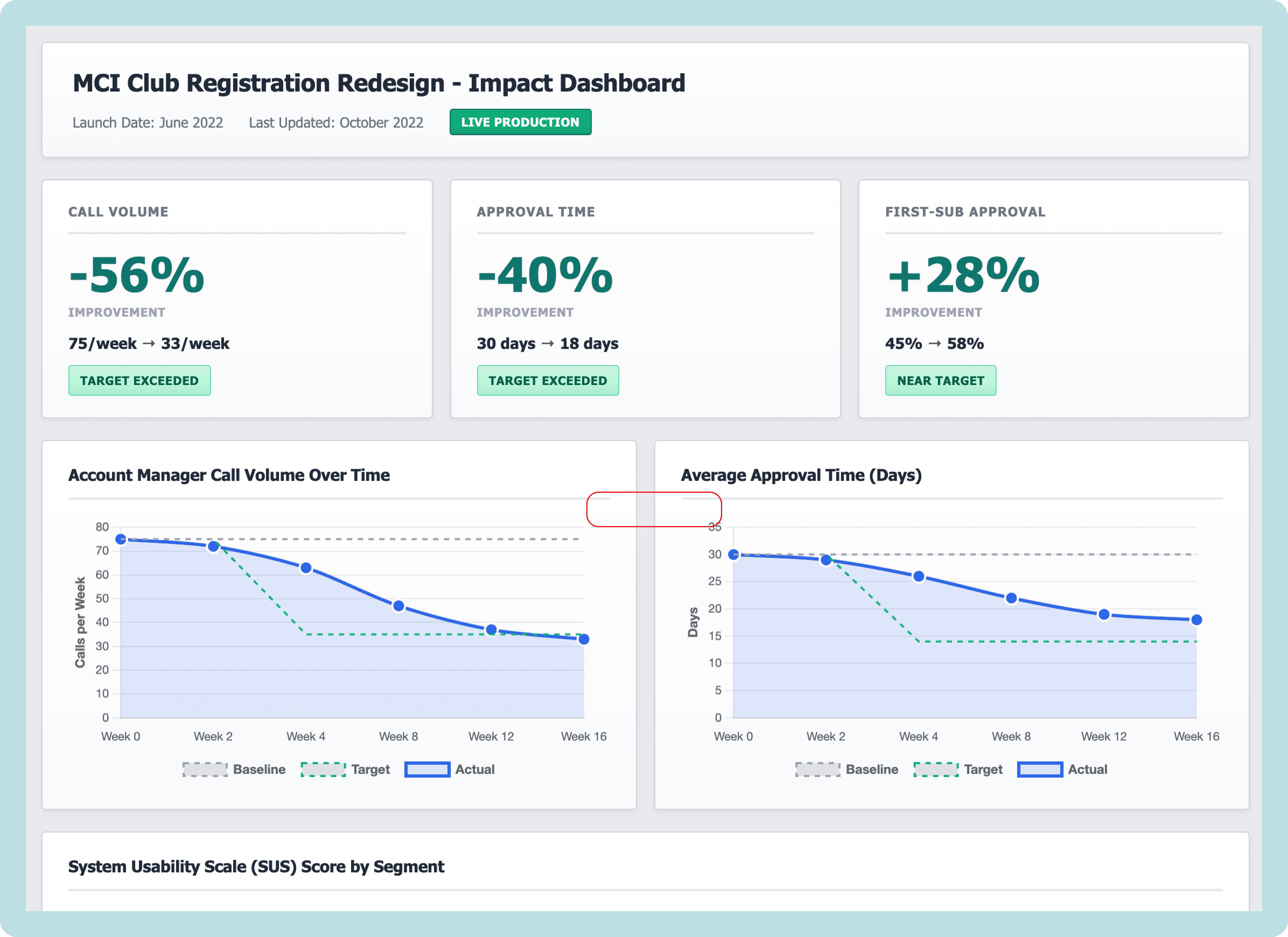
56% reduction in support calls (4 months post-launch)
40% faster approval time (30 days → 18 days avg)
37% call reduction (2 months post-launch)
28% increase in first-submission approval rate
Team:
1 UX Researcher
1 UX Designer
2 Design System Designers (oversight)
Multiple IT developers
Reporting to: Service Design & Product Design Head
A NOTE ON LANGUAGE
This project was conducted entirely in Persian (Farsi), including all research sessions, stakeholder workshops, documentation, and design artifacts. For this case study, I've recreated key diagrams, frameworks, and boards in English to make the process accessible to international readers. Where possible, I've preserved the original structure and insights while translating the content.
EXECUTIVE SUMMARY
MCI Club, A module within the enterprise resource planning system connecting Iran's largest telecommunications company with hundreds of sales centers nationwide, had become operationally dysfunctional. Years of siloed feature requests created a system where opening a new sales center took 30 days and generated 75+ support calls per application. Eight departments worked in isolation, account managers spent their days troubleshooting instead of supporting, and users across vastly different contexts—from tech-savvy urban teams to rural first-time computer users—all struggled with the same bloated, opaque interface. No comprehensive information architecture existed, workflows were undocumented, and nobody understood how their work connected to others.
Over six months, I led a strategic redesign combining macro-level restructuring with micro-level interaction design. We conducted 50+ stakeholder sessions producing 78 pages of documentation, mapped all user roles and permissions, and iteratively refined the information architecture through five versions with cross-departmental collaboration. For the highest-impact workflow—sales center registration—we employed a layered improvement strategy: first reorganizing the IA to clarify ownership and align permissions, then enhancing the already-improved workflow with progressive disclosure, smart filtering, and contextual guidance. The result: 56% reduction in support calls, 40% faster approvals, 28% increase in first-submission success, and a system that finally worked for everyone from urban power users to rural novices—all validated through rigorous testing and measured via a live impact dashboard that communicated success to leadership.
THE CHALLENGE
Siloed Teams, Fractured Workflows, Invisible Problems
MCI Club—the ERP module connecting MCI's headquarters with hundreds of sales centers and government telecommunication offices across Iran—had become a labyrinth. Over years of organic growth, each department (Business Analysis, Workflow, Finance, Marketing, Sales, Executive) had requested features in isolation. The result? Conflicting functionality, forgotten workflows, and a system where no one truly understood how their work connected to others.
The breaking point: Account managers were drowning in calls from frustrated sales centers. A simple task like opening a new sales center took up to one month and generated hundreds of support requests. The system that was meant to enable communication had become the source of confusion.
As a semi-governmental enterprise serving millions of customers nationwide, MCI needed an ERP that could scale across vastly different contexts—from tech-savvy teams in Tehran to first-time computer users in rural villages.
Phase 1: Understanding the Invisible (Months 1-3)
Starting with "I don't know what I don't know."
I was handed an information architecture diagram labeled "MCI Club." It was deceptively simple—a dozen boxes, a few connections. My instinct told me this couldn't possibly represent the complexity I'd heard about in stakeholder meetings.

Something didn't add up. If this IA was accurate, why were we hearing about so many problems?
Making the Case for Discovery
I brought my concerns to my direct manager, the Service Design Head. "This IA is too simple. I think it's broken, but I need time to understand what we're actually dealing with before we redesign anything."
The pressure was to start designing immediately—stakeholders wanted solutions, not more questions. But I made the case that designing without understanding would waste months of implementation work on the wrong solutions.
After reviewing the initial stakeholder feedback and the discrepancies I'd identified, we made a strategic decision together: invest 3 months upfront in comprehensive discovery. It felt risky, and I had to defend this timeline repeatedly, but my manager backed the approach.
The Research Plan
Together, we designed a comprehensive discovery process:
50+ stakeholder sessions across all departments
Contextual inquiries with account managers during peak call hours
Workflow shadowing across Business Analysis, Finance, Workflow, and Sales teams
Comparative analysis of how different teams used the same features
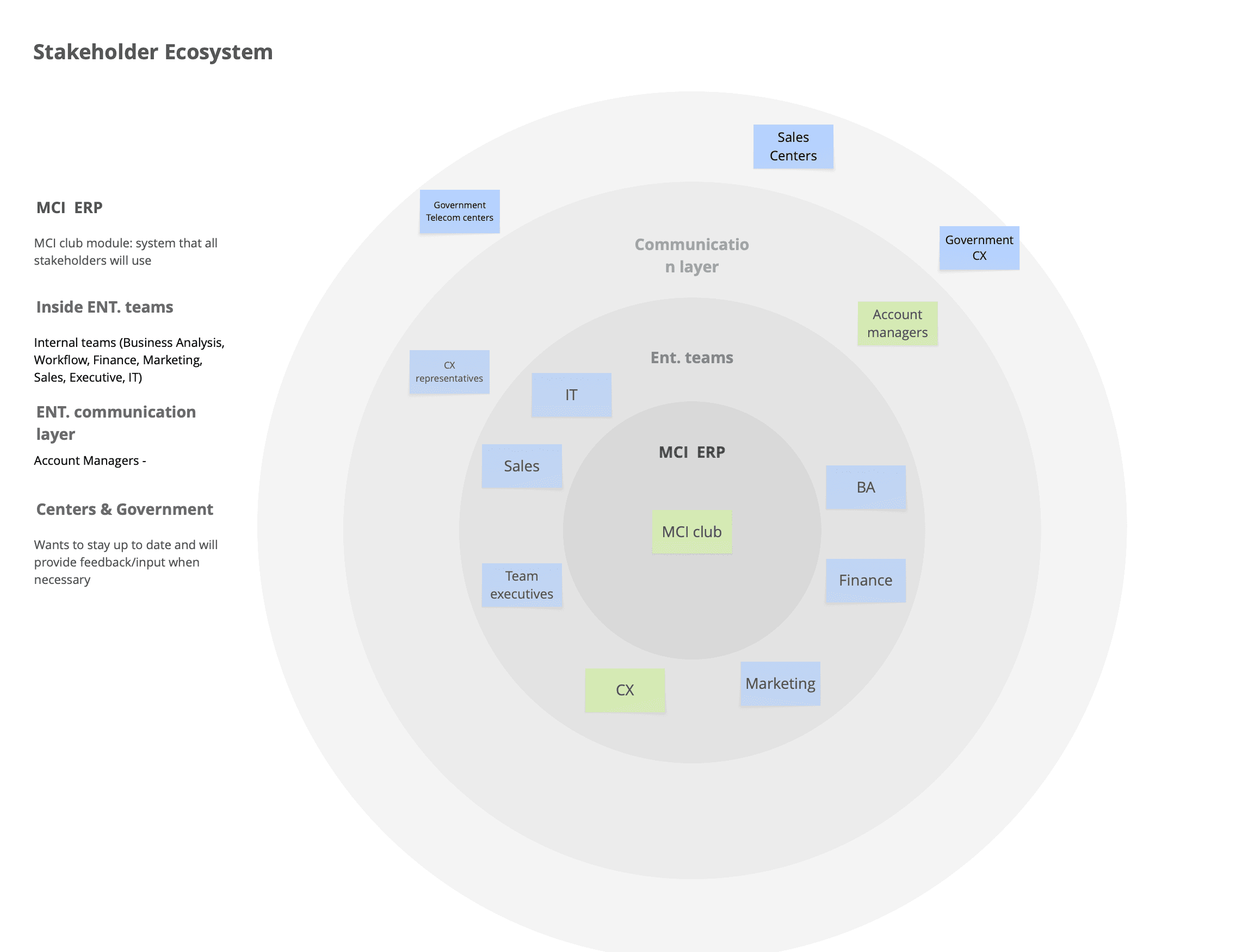
I simpliefied the stakeholder ecosystem for the purpose of this case study, but in reality there are more player in this project, such as third party companies, infrastructure provider companies, governement relations and…
Synthesizing Complexity
The 50+ stakeholder sessions produced 78 pages of session notes documenting workflows, pain points, technical constraints, and interdependencies.
To make sense of this complexity, our design team conducted multiple synthesis sessions using Miro boards to:
Cluster findings by theme (workflows, user roles, technical debt, communication gaps)
Map dependencies between departments
Identify systemic patterns vs isolated issues
Surface conflicting requirements between teams
This synthesis work revealed that the problem wasn't just incomplete documentation—it was systemic misalignment between how the system was designed and how work actually happened.
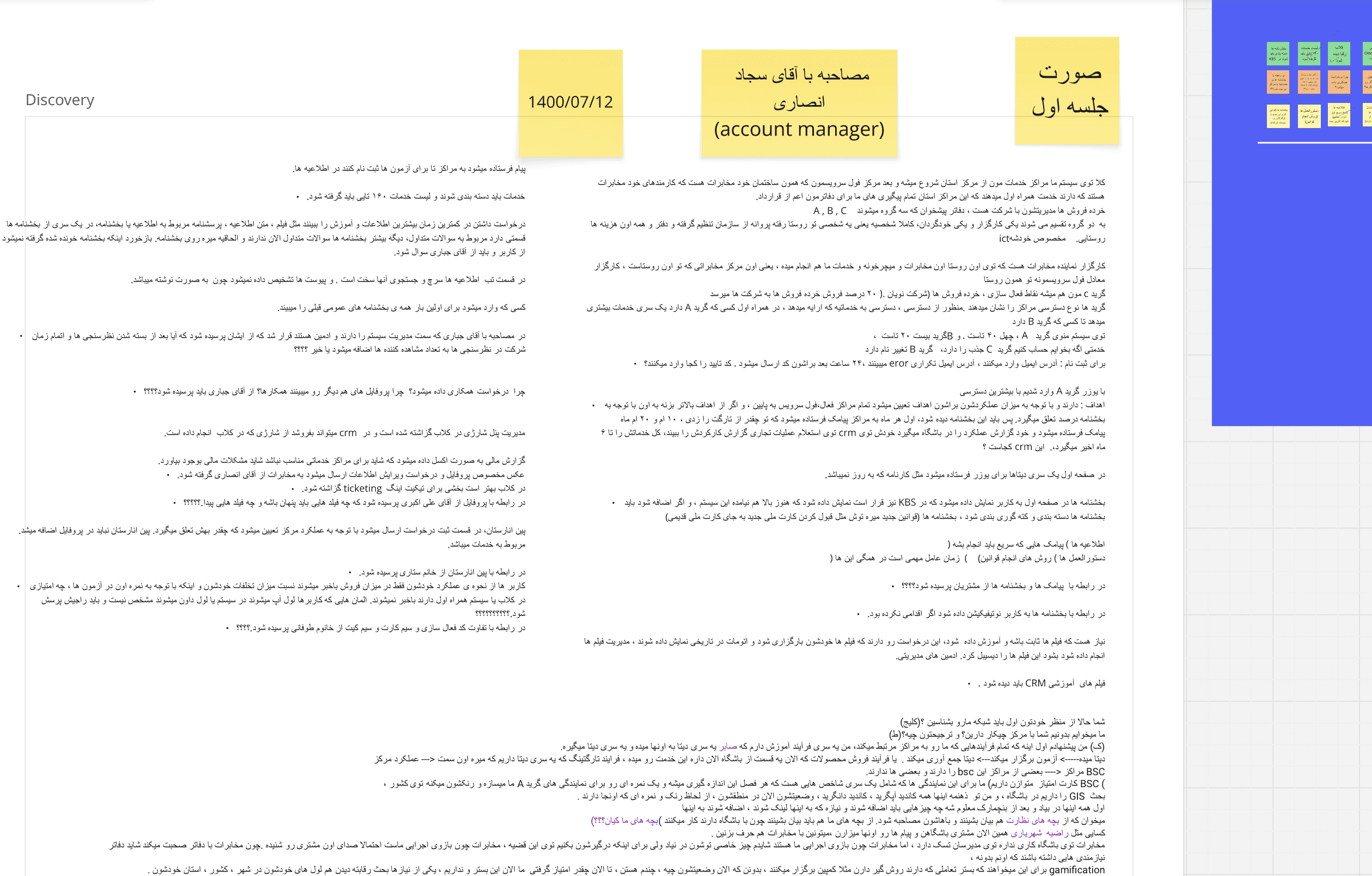
(An example of session's note )
What I Discovered
The original IA wasn't wrong—it was incomplete. It showed the intended structure, but missed the reality of how teams actually worked. Through hundreds of hours of observation and conversation, patterns emerged:
Insight 1: Workflow Blindness
Teams operated in silos with no visibility into upstream or downstream impacts. The Business Analysis team would approve a request without knowing it would create bottlenecks for Finance. Sales teams couldn't see what Government Approval teams needed, causing endless back-and-forth.
Insight 2: The Account Manager Bottleneck
Account managers had become human routers—manually translating between the system and sales centers because the system couldn't communicate clearly. They spent 60-70% of their time answering "Where is my request?" and "What document is missing?" calls.
Insight 3: One System, Many Literacies( Outside of Enterprise)
The same interface served:
Urban, tech-savvy users in Tehran who wanted efficiency and speed
Rural, first-time users in villages who needed guidance at every step
Government officials who require formal documentation and compliance
The system was designed for none of them.
Systems diagram showing all teams, their tools, and pain points
Highlight communication breakdowns with red indicators
Show information flow (or lack thereof) between teams
Annotate with specific problems discovered
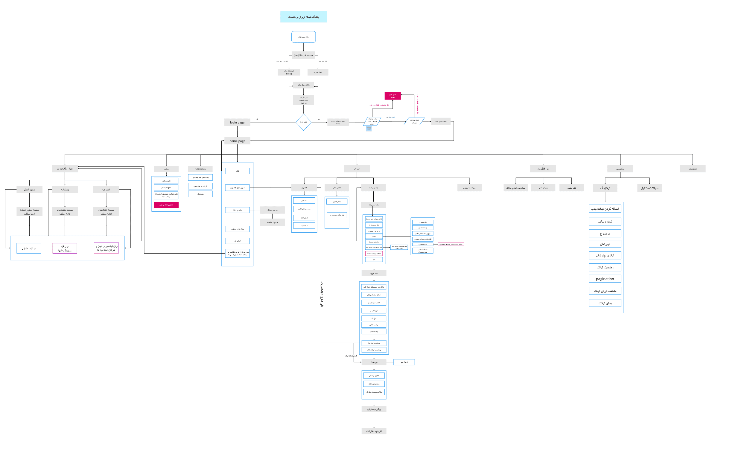
Phase 2: Mapping the Real System (Month 3)
Building the Architecture That Actually Existed
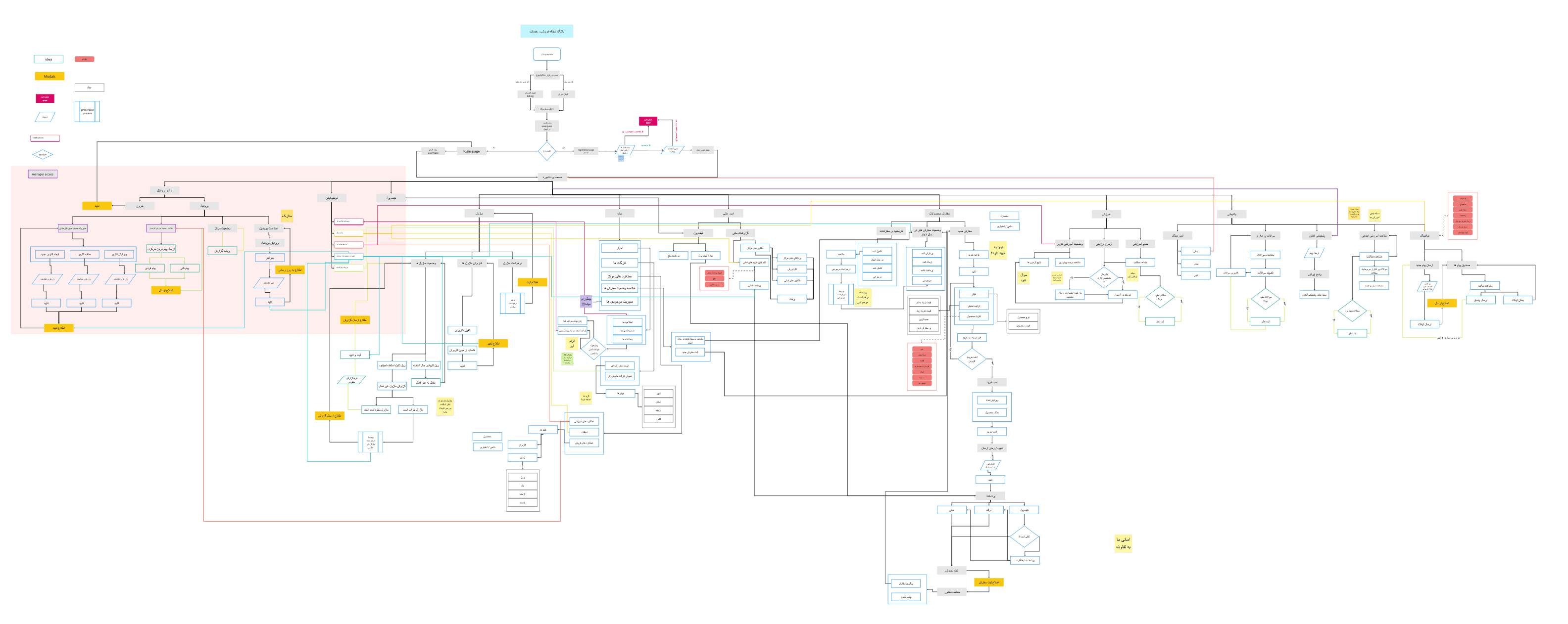
With insights from 50+ sessions, I began the painstaking work of documenting the real information architecture—not what was intended, but what had organically evolved.
I mapped:
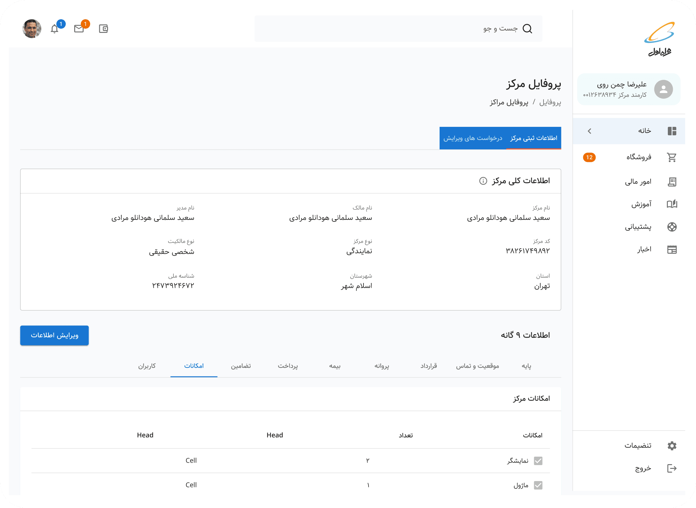
Every section of MCI Club (Sales Center Profiles, Government Center Profiles, Notifications, Dashboard, News, Financials, Orders & Inventory, Education, Help & Support)
Every user role and its permissions
Every workflow and its dependencies across teams
Every API connection to government systems
The result was shocking. What started as a "simple" ERP had metastasized into a system with dozens of conflicting workflows, redundant features, and unclear ownership.
Phase 3: Collaborative Redesign (Month 4)
Designing With, Not For
Armed with a complete picture, I facilitated a series of co-design workshops with representatives from each department. The goal wasn't just to fix the IA—it was to rebuild trust and shared understanding across teams.
The Workshop Series
Over 4 weeks, I ran structured sessions:
Week 1: Shared the comprehensive IA findings and pain points
Week 2: Workflow mapping exercises where teams saw their interdependencies for the first time
Week 3: Prioritization workshops to decide what to keep, fix, or remove
Week 4: New IA proposal and validation

The turning point: During Week 2, an account manager and a government liaison sat next to each other for the first time. The account manager explained how unclear documentation requirements caused delays. The liaison explained the legal compliance needed. In 20 minutes, they redesigned a workflow that had caused problems for years.
Information Architecture version 2
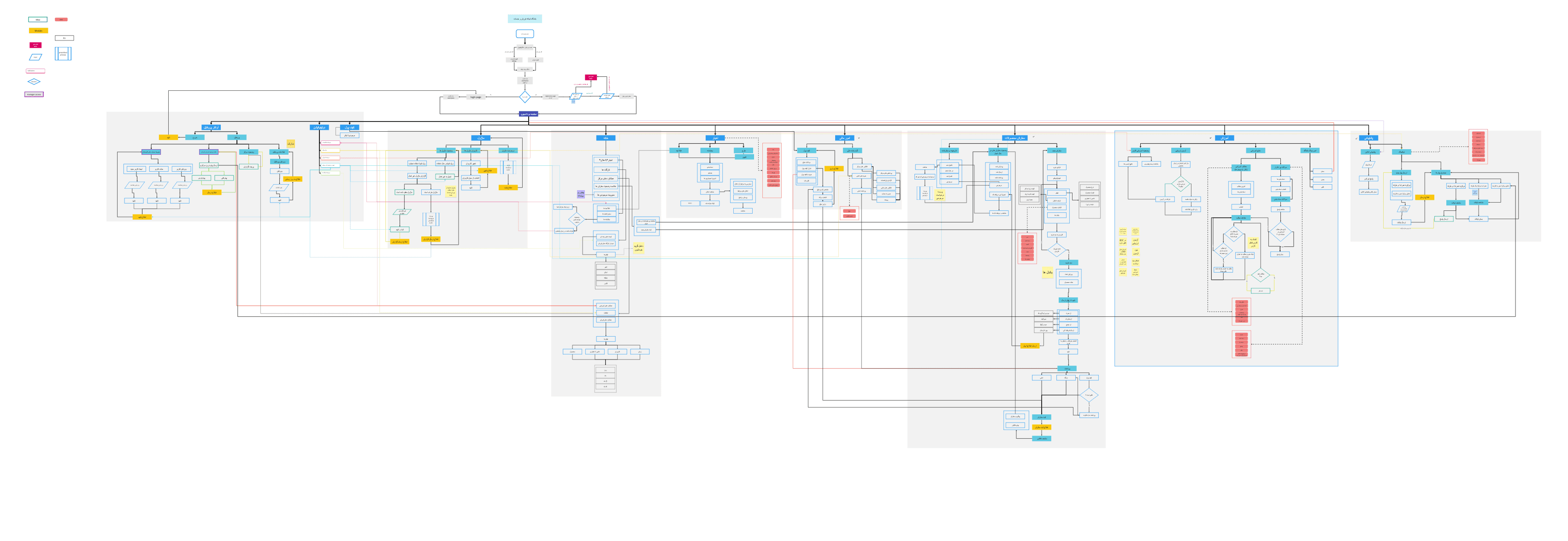
Information architecture version 3
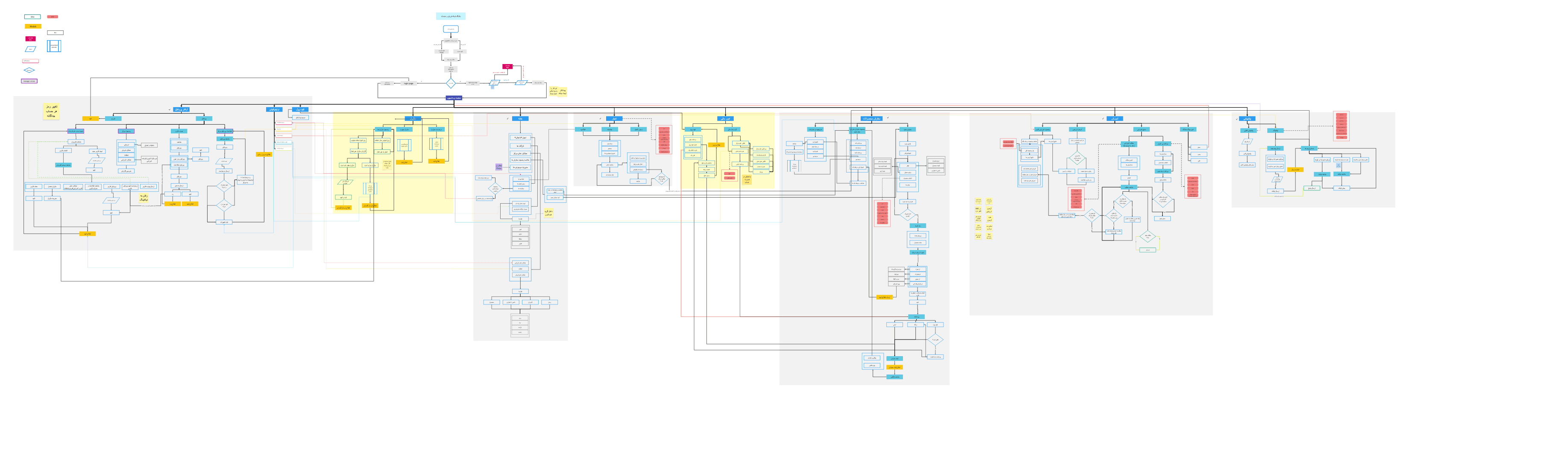
Information architecture version 4
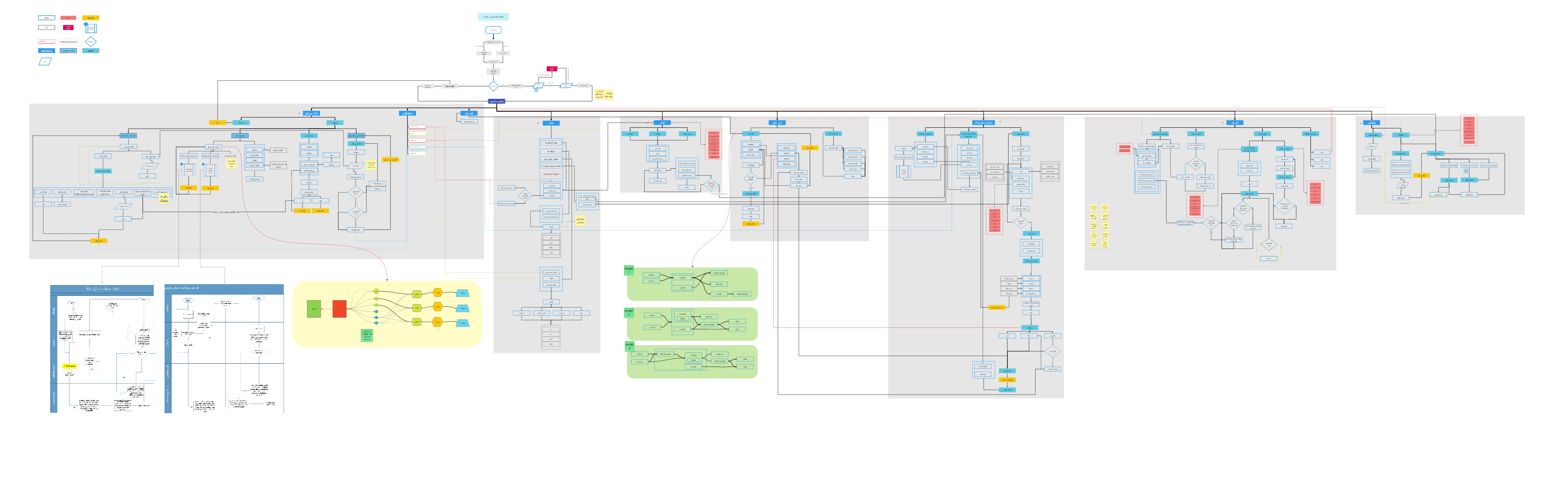
The Final Version
Leadership Buy-In
I presented the new IA proposal to MCI's Sales & Services Dean and department heads. The presentation focused on three things:
The business cost of the current system (estimated hours wasted, call volume, and delayed revenue)
The opportunity of a unified workflow (faster approvals, reduced support burden, scalability)
The roadmap for phased implementation
Result: Full approval and budget allocation for the redesign.


Phase 4: Workflow-by-Workflow Redesign (Months 5-6)
From System Architecture to Human Experience
With the macro-level IA redesigned, the challenge became: where do we start? I facilitated a prioritization workshop with department heads to establish a weighted scoring framework.
Prioritization Framework
Criteria | Weight | What We Measured |
|---|---|---|
Business Impact | 40% | Call volume, time waste, revenue delays, satisfaction impact |
User Pain Severity | 30% | Support tickets, escalations, and research findings |
Frequency of Use | 20% | Daily operations, number of users affected |
Technical Feasibility | 10% | System dependencies, development complexity, API limitations |
Workflow Assessment Results
I assessed all major workflows across MCI Club's 8 sections—from Sales Center Profiles to Help & Support. Here are the top 6 priorities from ~30+ workflows evaluated:
Workflow | Score | Priority | Why |
|---|---|---|---|
Sales Center Registration | 87/100 | 1 | 50-100 calls/application, 30-day approvals, 200+ applications/year |
Order & Inventory Management | 82/100 | 1 | High error rate, daily operations affected |
Financial Reconciliation | 78/100 | 1 | Time-intensive, error-prone |
Employee Onboarding | 75/100 | 2 | High effort, government dependencies |
Government Approvals | 72/100 | 2 | Complex integration requirements |
News & Announcements | 54/100 | 3 | Lower frequency, minimal business impact |
Note: Additional workflows like Help Desk ticketing (68/100), Equipment tracking (61/100), Training content management (59/100), and 20+ others were also scored but prioritized for future phases.
Why Sales Center Registration Won
Beyond the highest score, this workflow was a microcosm of every systemic problem we'd discovered:
Siloed teams (Sales → Business Analysis → Government)
Poor transparency and communication
Information overload
Diverse user literacy levels
Unclear error states
If we could fix registration, we'd create a blueprint for fixing everything else.
Metric | Baseline | Target | Impact |
|---|---|---|---|
Account manager calls | ~75/week | ~35/week | -50% |
Average approval time | 30 days | 14 days | -53% |
First-submission approval rate | ~45% | ~60% | +30% |
With prioritization complete and success criteria defined, I delved into redesigning the Sales Center Registration—the flagship example of how the new MCI Club would operate.
DEEP DIVE: REDESIGNING SALES CENTER REGISTRATION
(This could be a separate case study itself, but I think it is better have it as a whole)
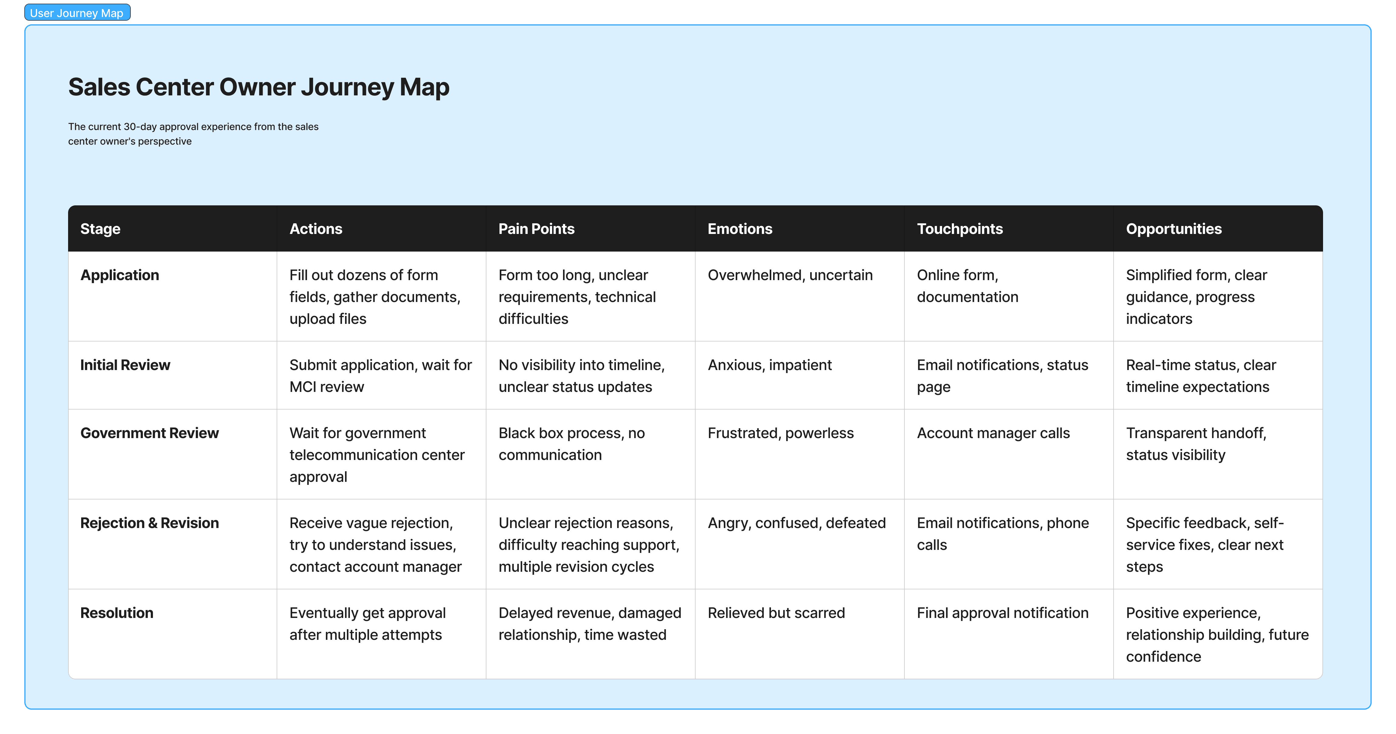
The Problem in Detail
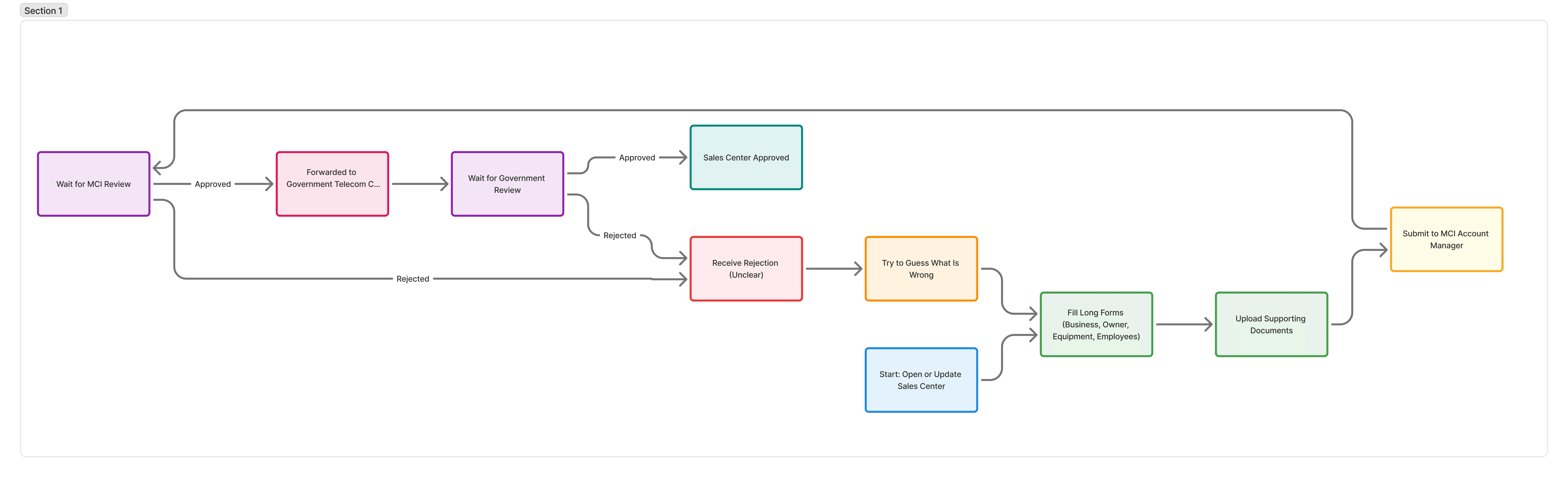
The 30-Day Approval Nightmare
When someone wanted to open a new MCI sales center (or update an existing one), they faced a Byzantine process:
Fill out dozens of form fields with business information, owner details, equipment specs, and employee data
Upload supporting documents (licenses, IDs, contracts, blueprints)
Submit to the MCI account manager for review
Wait for MCI approval
Get forwarded to the government telecommunication center
Wait for government approval
Receive rejections with unclear reasoning
Try to figure out what's wrong and resubmit
Repeat steps 4-8 indefinitely
The specific pain points I observed:
After this, we went stright to create the User Journey Map diagram and the JBTD framework
yes i know these are not fancy looking like any other design team! ;)
Field Research: Understanding Context
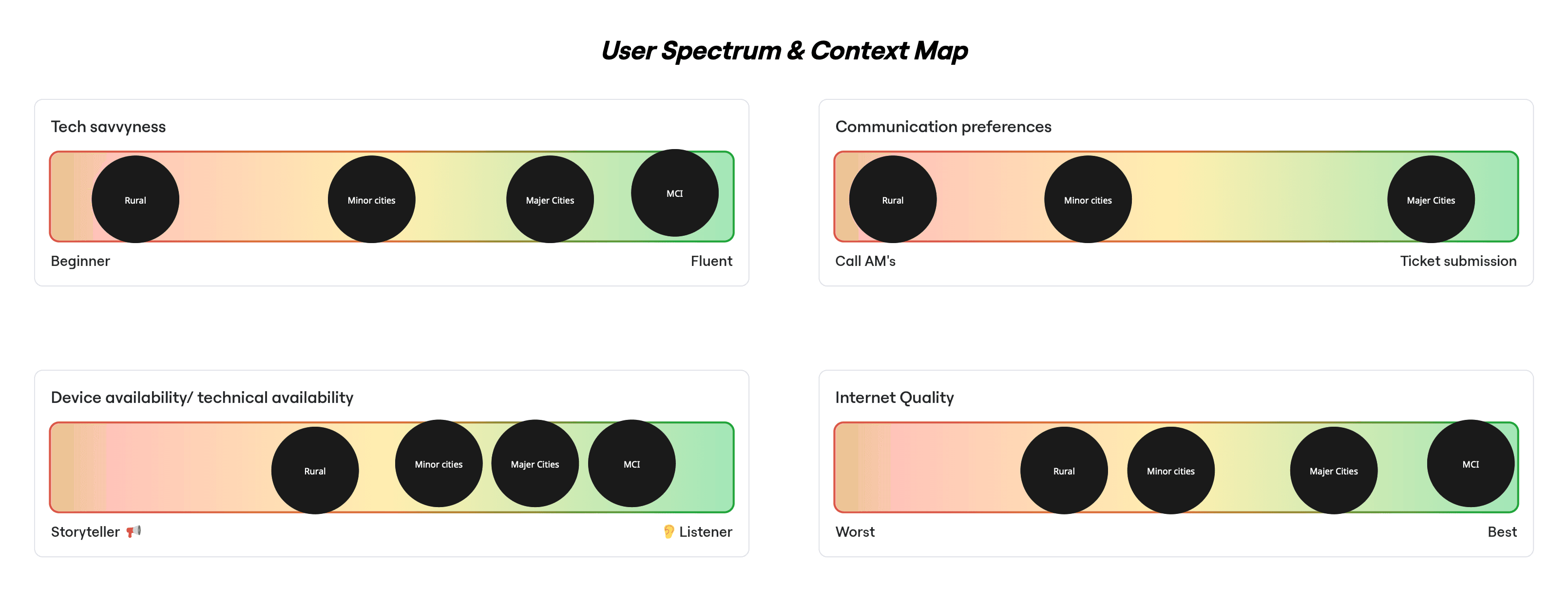
From Tehran to Rural Villages
I knew that designing for "sales center owners" as a monolith would fail. I needed to understand how context shaped needs. So I traveled.
Urban Centers (Tehran, Mashhad, Isfahan):
Modern offices with IT staff
Owners are comfortable with technology
Fast internet, desktop computers
Primary need: Efficiency - just show me what's wrong so I can fix it fast
Provincial Capitals:
Mix of tech comfort levels
Reliable internet, but often mobile-first
Primary need: Clarity - make requirements understandable
Rural & Village Centers:
Often, first-time computer users
Slow/unreliable internet
Shared computers or mobile devices only
Primary need: Guidance - walk me through every step, don't assume I know anything
Synthesizing Patterns from Raw Research
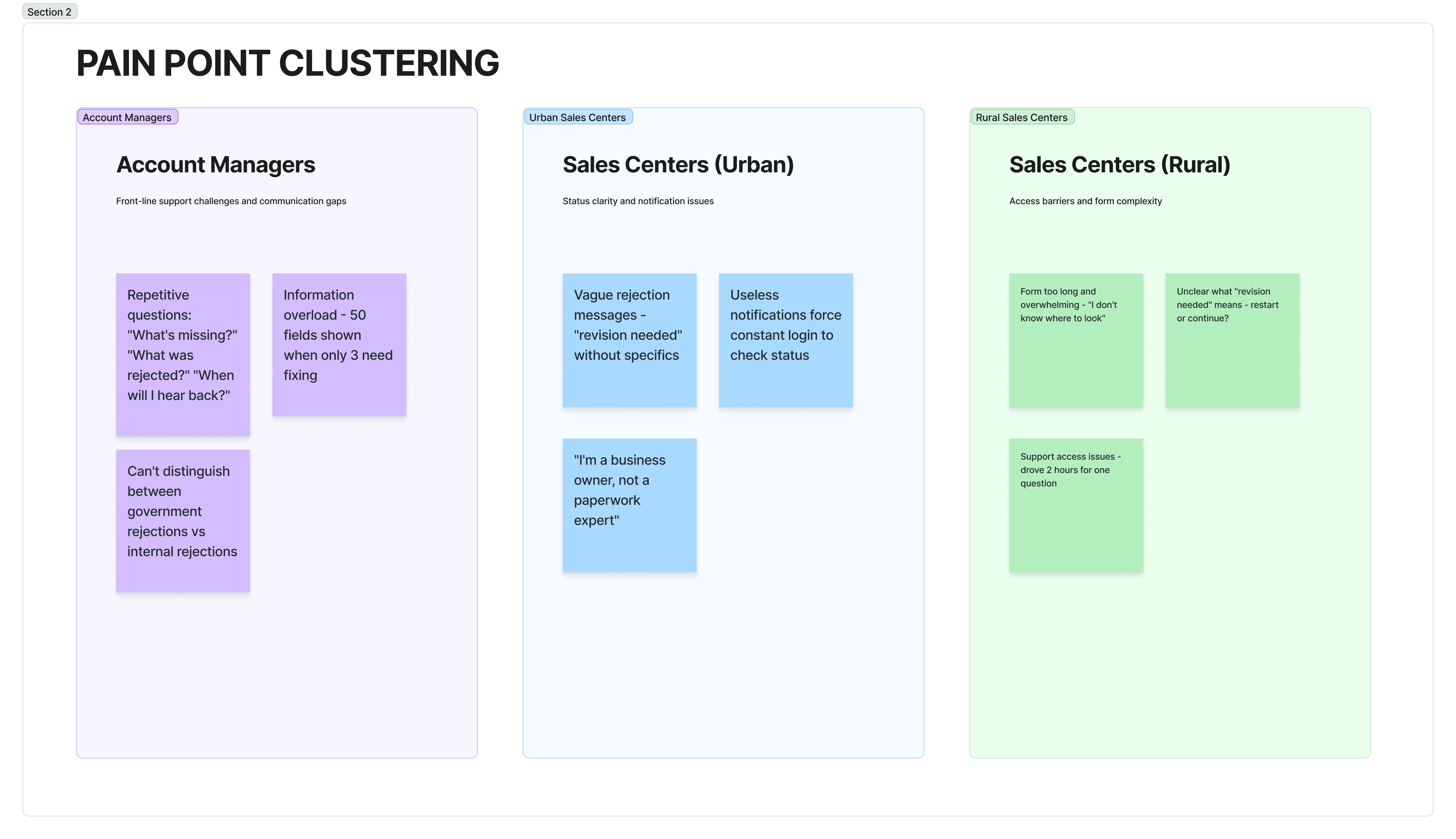
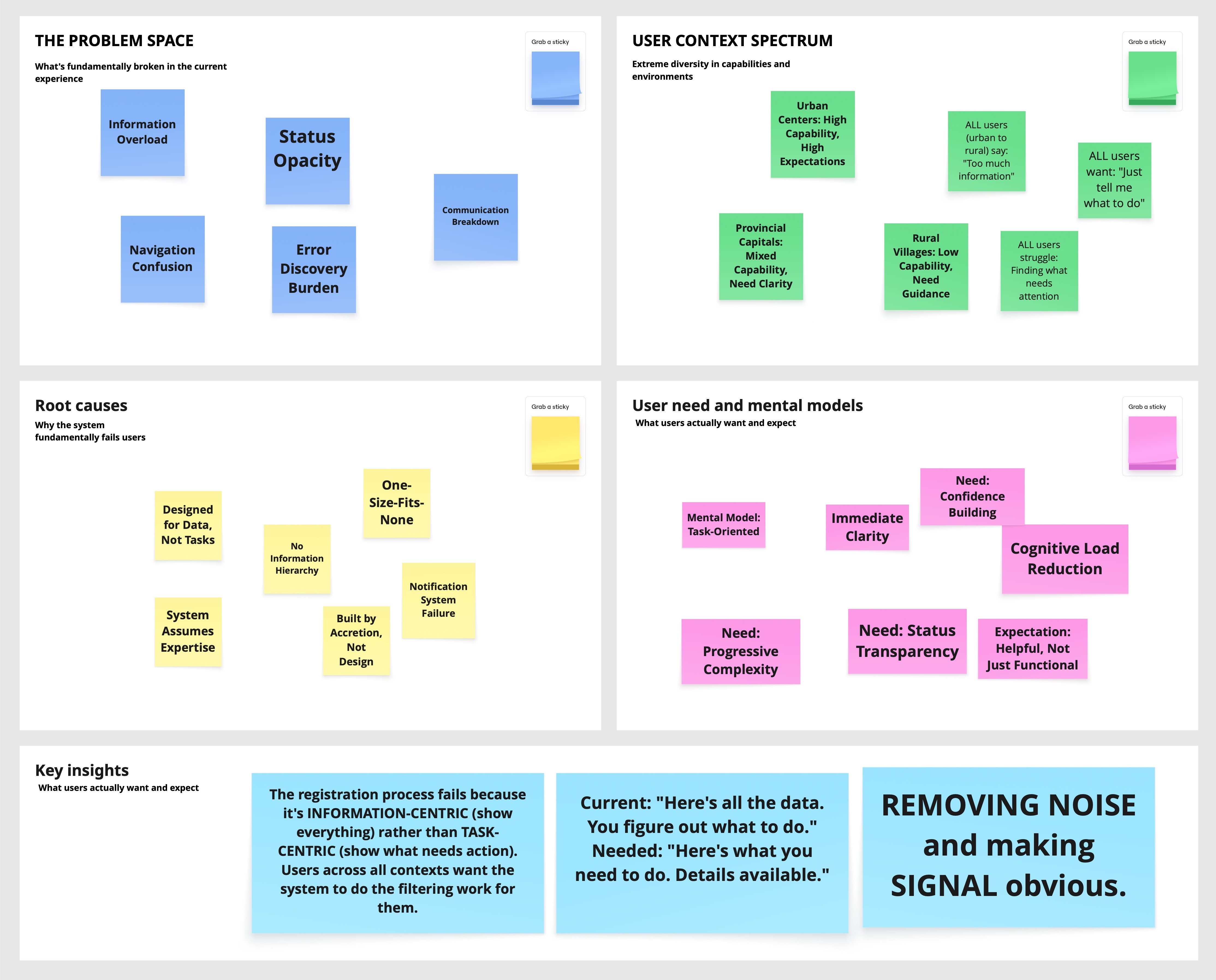
Back from the field, I had hundreds of observations, quotes, and pain points. I organized these into a synthesis framework to identify patterns.
Stage 1: Organizing by Themes
I created four thematic areas and placed all research findings (unclustered) into them:
Problem Space: What's fundamentally broken?
User Context Spectrum: Who are we serving and how do they differ?
Root Causes: Why does the system fail users?
User Needs & Mental Models: What do users actually want and expect?
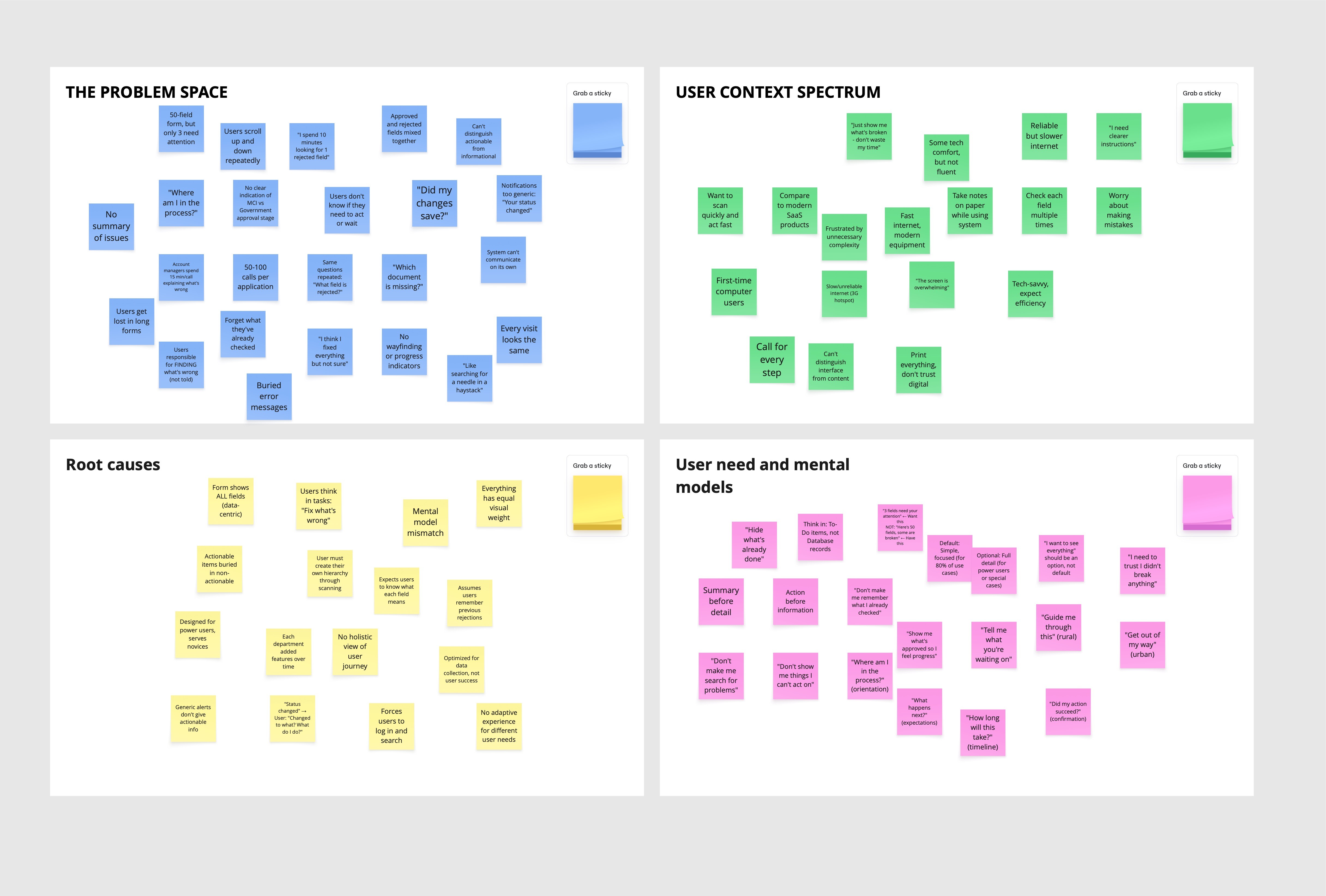
Stage 2: Finding the Patterns
Within each theme, I clustered similar findings to reveal patterns. The clusters told a story: While user contexts varied dramatically (tech-savvy urban to first-time rural users), the core problem was universal—information overload. Every user segment, despite different capabilities, struggled with the same fundamental issue: the system showed everything when they only needed to see what required action.
Key Insight Emerged: The registration process fails because it's information-centric (show everything) rather than task-centric (show what needs action). Users across all contexts wanted the system to filter information for them—urban users for speed, rural users for simplicity, but the underlying need was identical.
Urban Centers: Fast internet, tech-savvy owners → "Just show me what's broken"
Provincial Capitals: Mixed tech comfort → "I need clearer instructions"
Rural Villages: First-time computer users, 3G connectivity → "The screen is overwhelming"
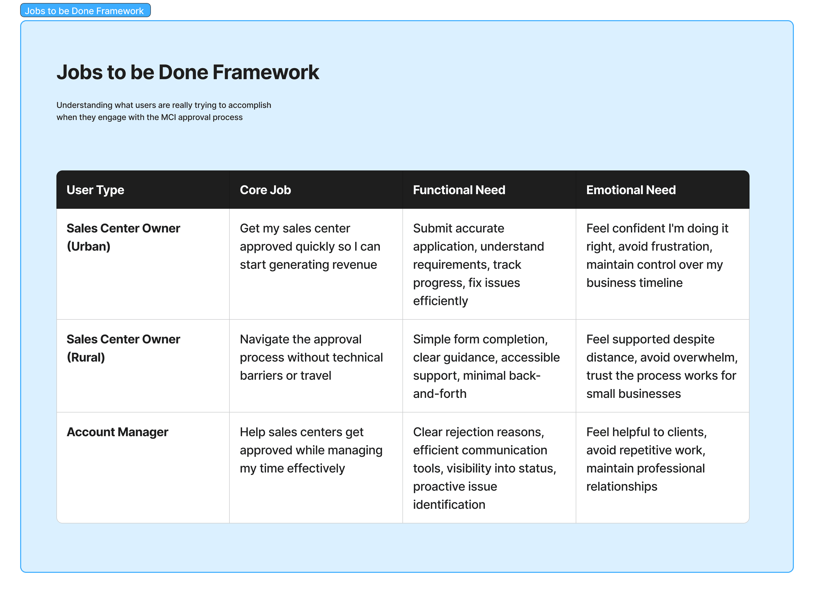
Understanding the Job
We mapped what users were actually trying to accomplish:
Main Job: Get my sales center approved so I can start operating
Sub-Jobs & Obstacles:
Understand requirements → Can't distinguish required from optional
Submit information → Unclear formats, no progress saving
Know if on track → No status visibility
Respond to issues → Generic errors, can't locate problems
Trust the process → System opacity
From Obstacles to Opportunities
We reframed job obstacles as How Might We questions and then to Product golas
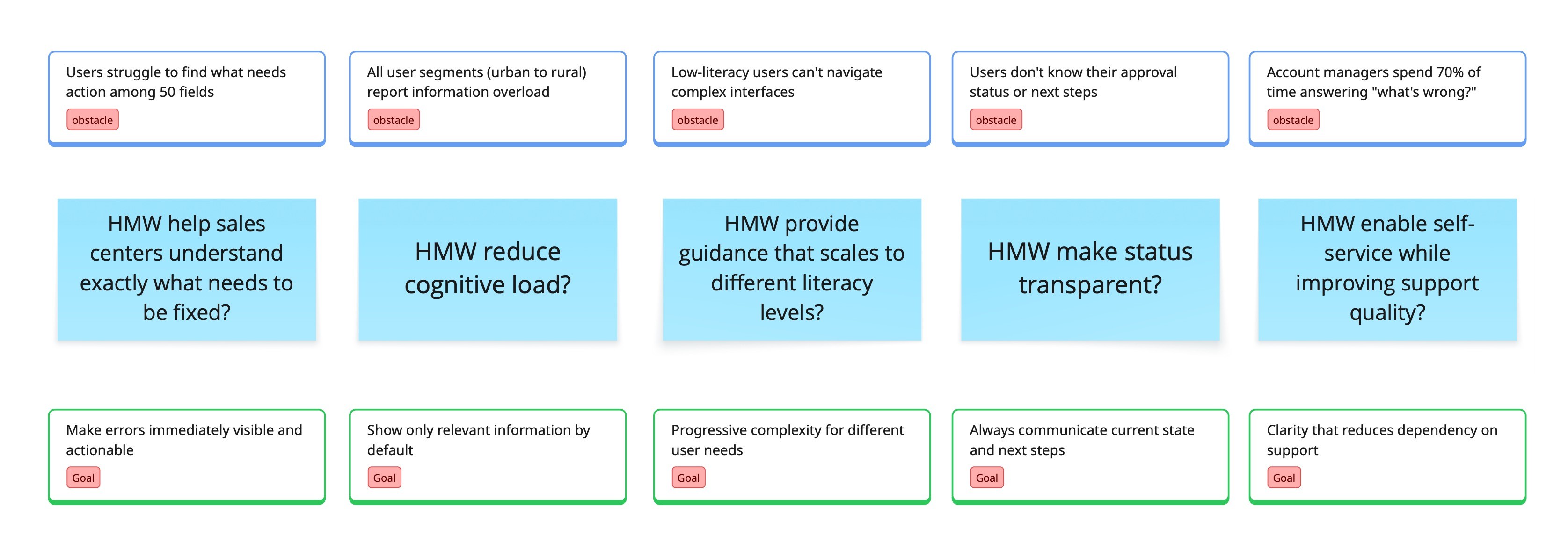
Later on, we translate the "Goals" into features:
Goal | Feature |
|---|---|
Errors immediately visible | Status summary: "3 fields need attention" |
Only relevant information | Progressive disclosure: hide approved, show problems |
Progressive complexity | "View all" toggle: simple default, full option |
Always communicate status | Progress stepper: Submission → MCI → Gov → Approved |
Enable self-service | Inline guidance: what's needed, why |
IDEATION & SOLUTION EXPLORATION
Choosing the Exploration Approach
With features defined, we needed to decide how to explore solutions. We considered several approaches:
Divergent brainstorming (Crazy 8s, design studios) would generate creative variety but risked novel patterns that hadn't been validated at scale.
Analogous inspiration (studying how other products solve similar problems) could spark ideas but might not translate to our specific constraints.
User co-creation workshops would ensure alignment but were impractical—gathering rural and urban users in the same room wasn't feasible.
Systematic pattern exploration would be slower but would leverage proven solutions, reduce risk, and allow us to defend decisions with data.
Given the scale (millions of users), context (semi-governmental), and timeline (six weeks), we chose systematic exploration: decompose the problem, research established patterns, combine into coherent concepts, validate through testing.
Problem Decomposition
We broke down "help users understand what needs attention" into four sub-problems:

Design Pattern Exploration
For each sub-problem, we researched established patterns from enterprise systems and consumer applications.
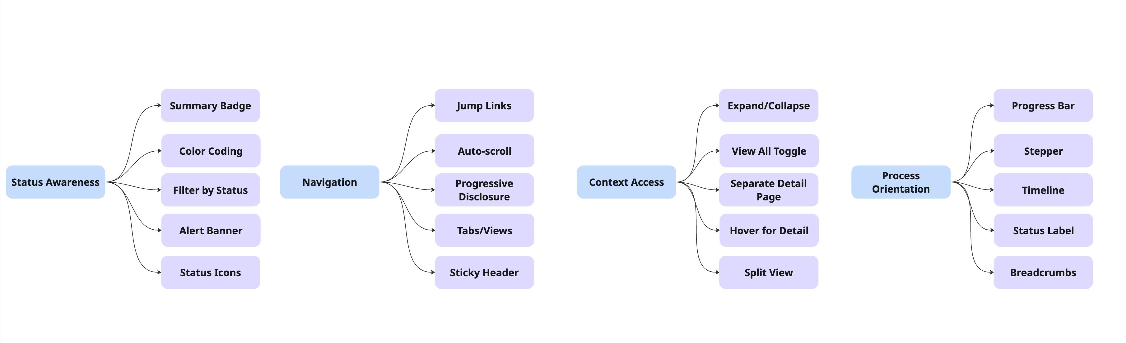
Sub-Problem 1: Status Awareness
How do users know what needs attention?
Selected for further exploration: Summary Badge + Color Coding, Summary Badge + Filter by Status
Sub-Problem 2: Navigation
How do users get to problem areas?
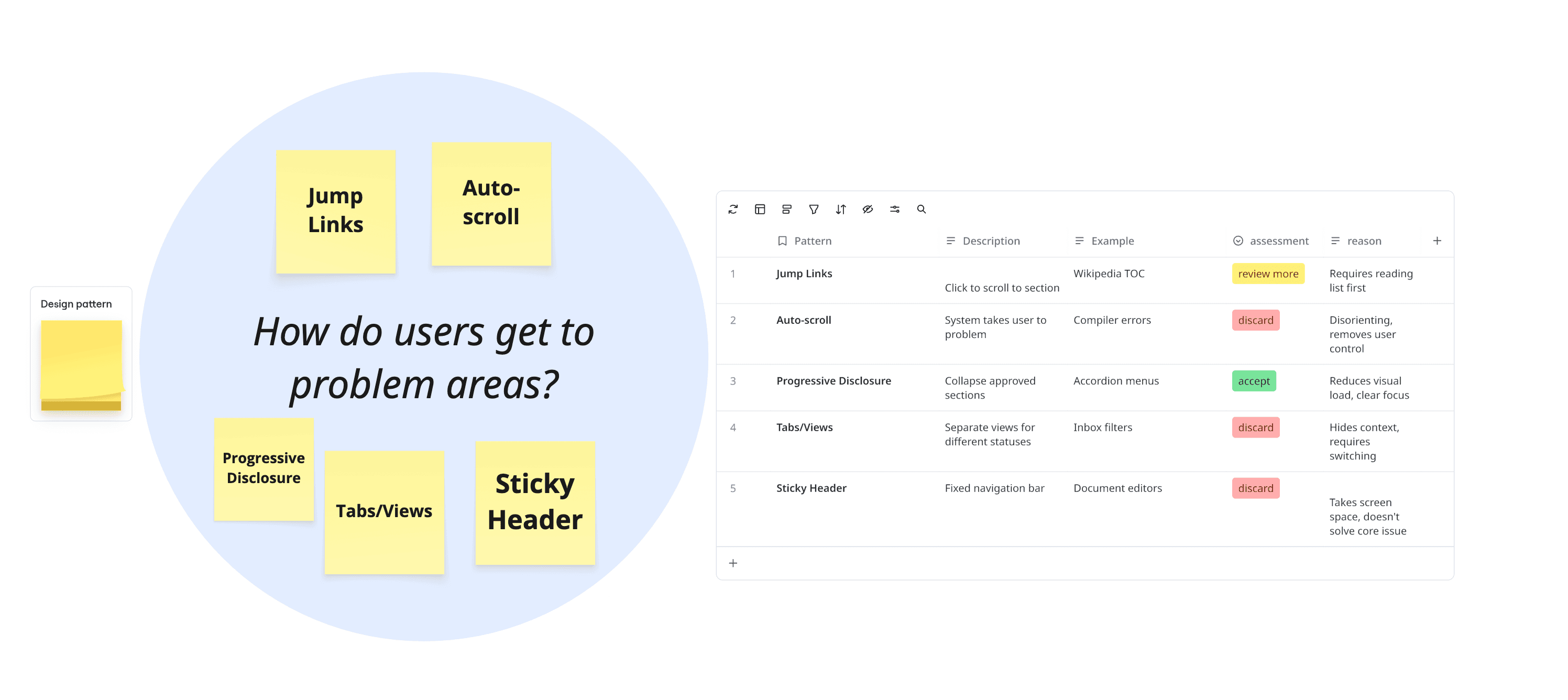
Selected for further exploration: Progressive Disclosure, Jump Links
Sub-Problem 3: Context Access
How do users see full information when needed?
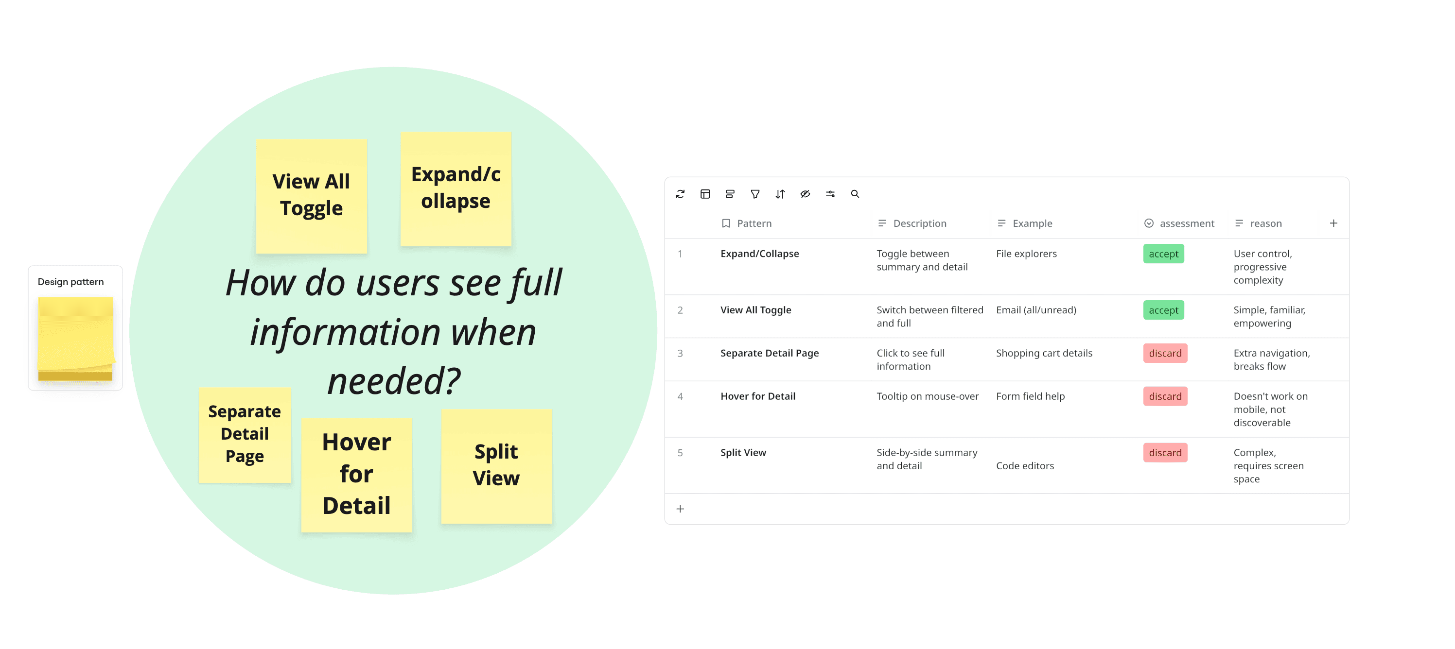
Selected for further exploration: View All Toggle, Expand/Collapse
Sub-Problem 4: Process Orientation
How do users determine their location?
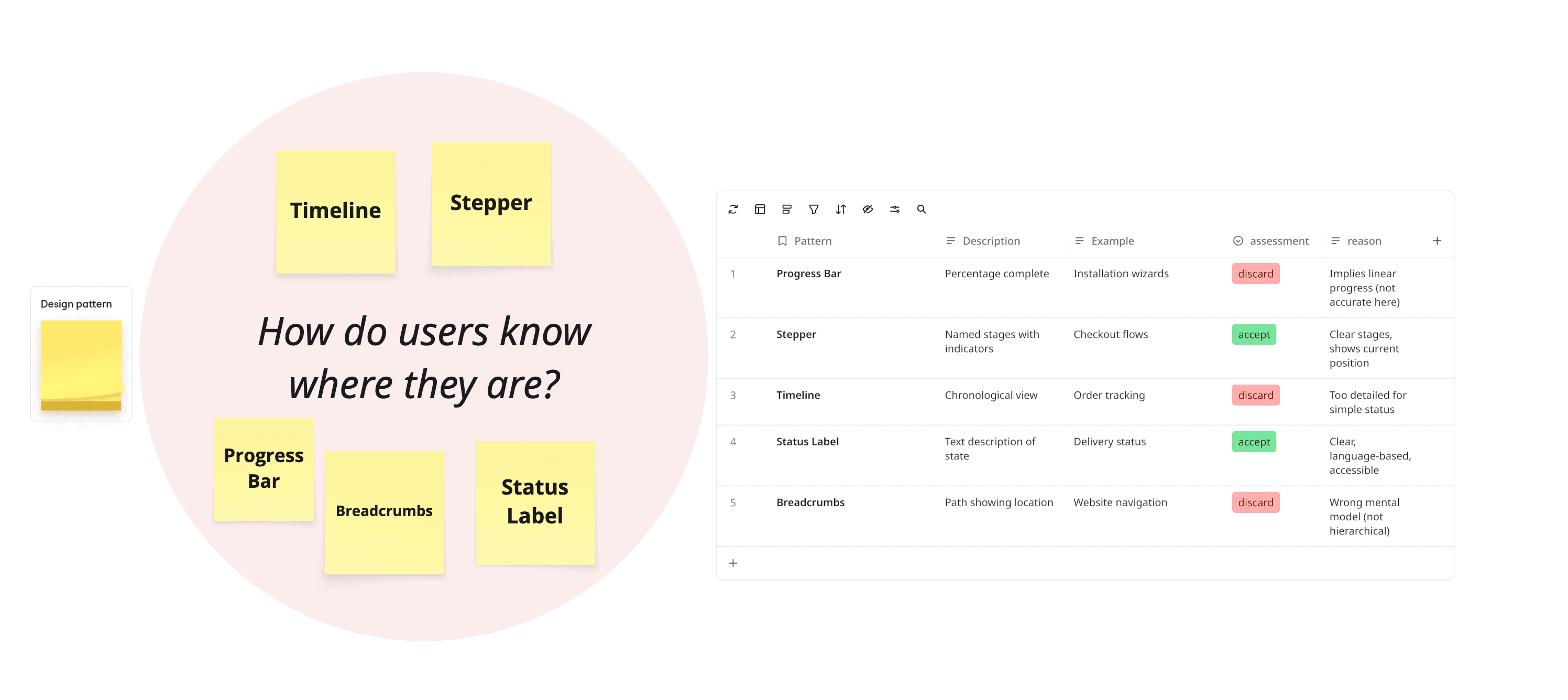
Selected for further exploration: Stepper, Status Label
Combining Patterns into Coherent Concepts
With proven patterns selected for each sub-problem, we explored how to combine them into complete, testable concepts. Not all combinations made sense—some patterns conflicted, others created redundancy.
Concept | Sub-Problem 1 | Sub-Problem 2 | Sub-Problem 3 | Sub-Problem 4 | Outcome |
|---|---|---|---|---|---|
A: Color Coding | Color Coding | Jump Links | View All Toggle | Stepper + Label | ✅ Selected for testing |
B: Progressive Disclosure | Summary Badge + Filter | Progressive Disclosure | Expand/Collapse | Stepper + Label | ✅ Selected for testing |
C: Tabs + Color | Color Coding | Tabs/Views | Separate Detail Page | Stepper | ❌ Too much navigation, hides context |
D: Auto-everything | Alert Banner | Auto-scroll | Hover tooltips | Timeline | ❌ Removes user control, too automated |
E: Minimal Change | Status Icons | Sticky Header | None | Status Label | ❌ Doesn't solve core information overload |
Why Concepts C, D, and E were rejected:
Concept C: Tabs fragment the experience, requiring users to switch views and lose overall context
Concept D: Automation removed user agency—testing showed users felt "dragged around"
Concept E: Minimal changes didn't address the fundamental problem of information overload
Why Concepts A & B advanced to testing:
Both use proven patterns from established systems (not novel inventions)
Both address all four sub-problems with coherent solutions
Both scale across user contexts (urban to rural)
Both are technically feasible within our constraints (6-week timeline, existing infrastructure)
They represent meaningfully different approaches: categorization (A) vs filtering (B)
The Two Concepts: A Closer Look
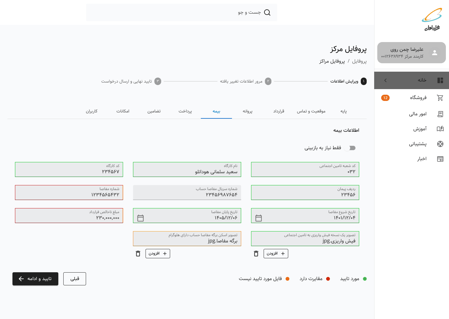
Concept A: Color-Coded Status System
Core approach: Give users visibility into every field's status through color categorization
How it addresses sub-problems:
Status Awareness: Color coding + legend (🟢 Approved | 🟡 Not qualified document| 🔴 Needs Revision | ⚪ Not Submitted)
Navigation: Tab layout to access each section + visual scanning by color
Context Access: View All toggle shows/hides non-problematic fields
Process Orientation: Progress stepper + status label at top
Hypothesis: Familiar from form validation patterns, gives complete visibility
Concept B: Progressive Disclosure System
Core approach: Show only what requires action, hide the rest by default
How it addresses sub-problems:
Status Awareness: Summary badge ("3 fields need your attention") + filtered view
Navigation: Progressive disclosure (collapsed approved sections, expanded problematic sections)
Context Access:
Expand/collapse controls + "View all fields" toggle + Explanation of rejection and what should be providedProcess Orientation: Progress stepper + status label at top
Hypothesis: Reduces cognitive load by filtering information, matches task-oriented mental model

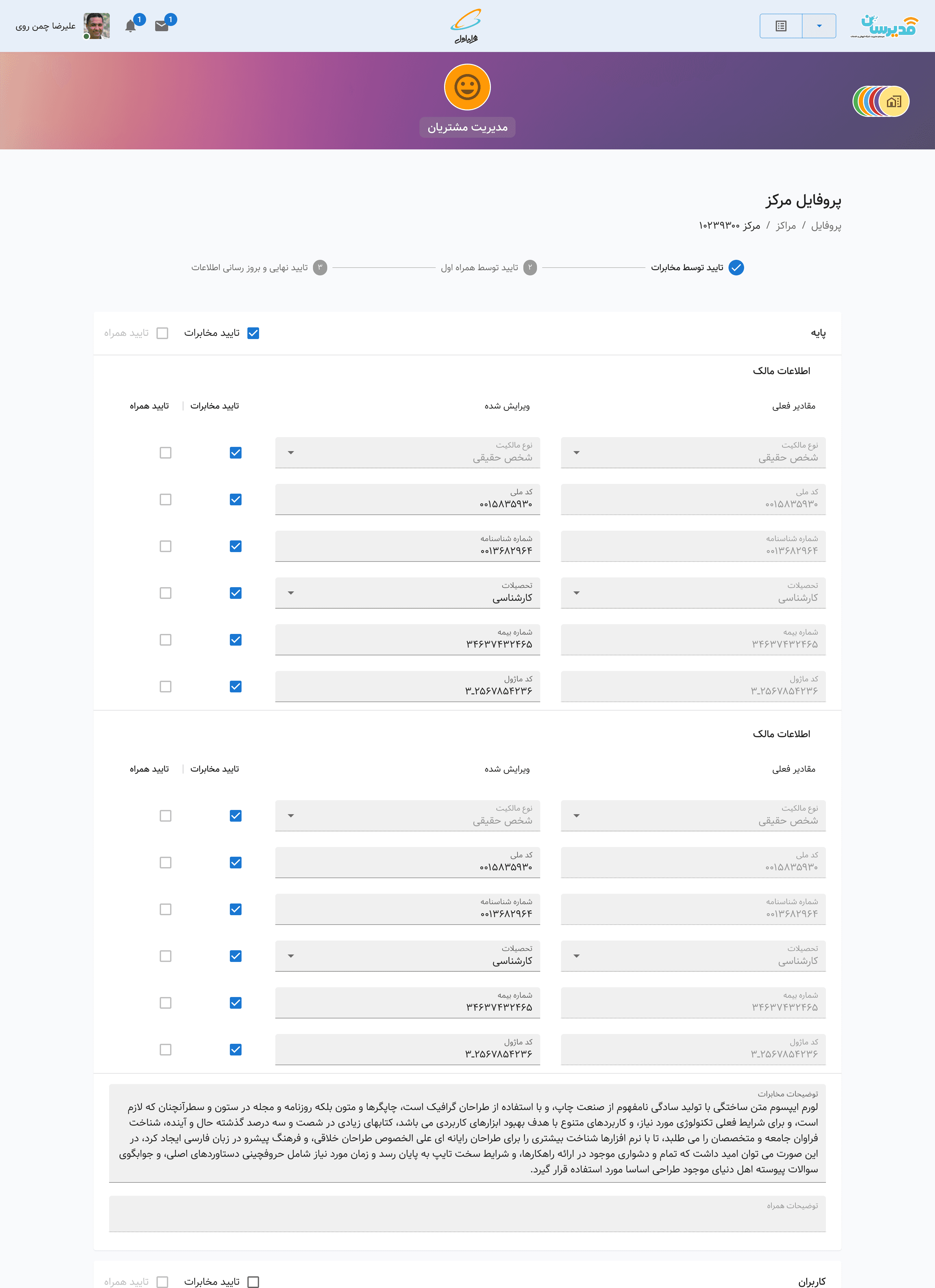
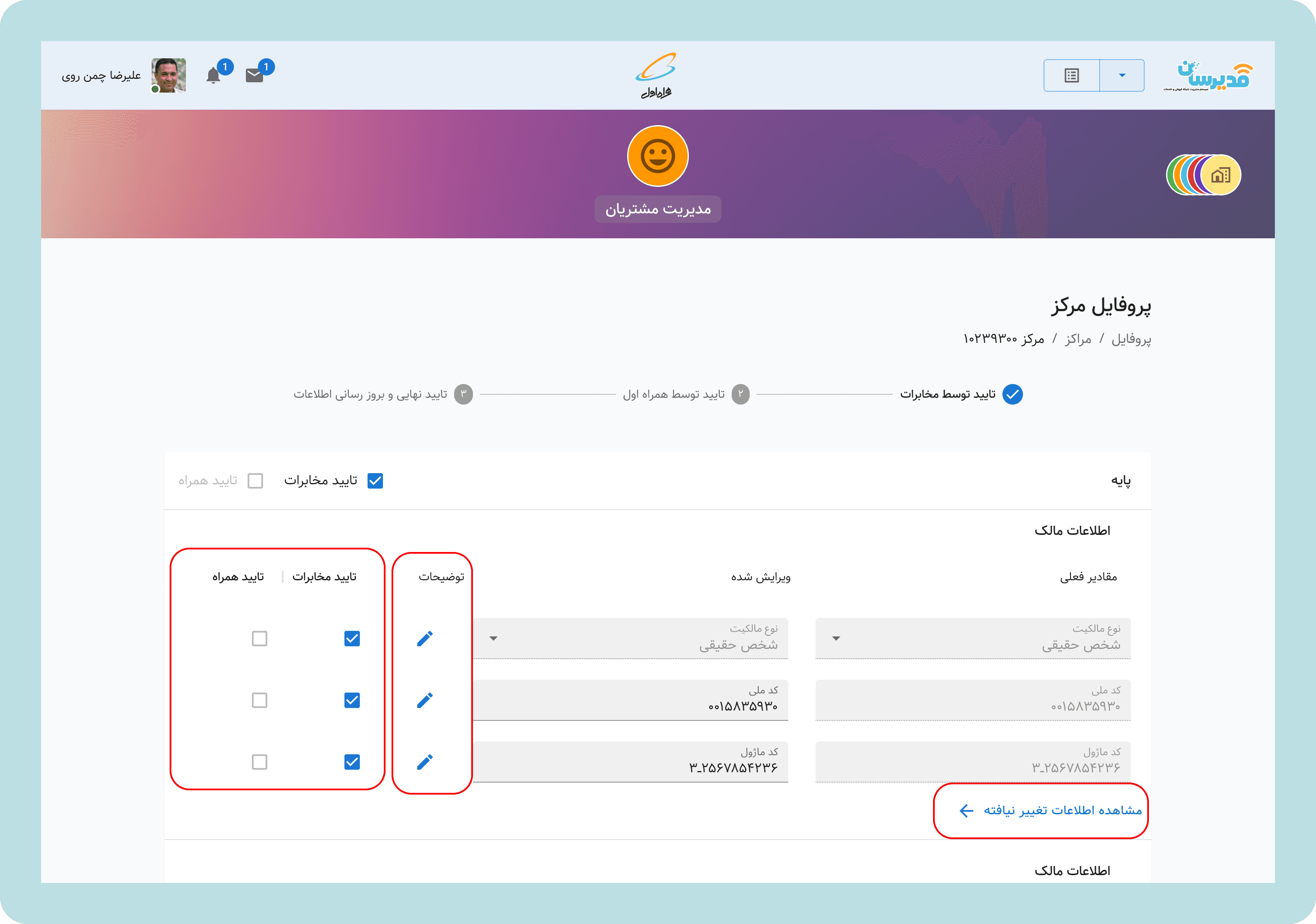
A unified solution for account managers:
Account managers could review this information through the Modirsan application( MCI unified ERP) through the Customers Service Module. We implemented a comprehensive solution for them too. We developed two solutions for Sales Centers; however, solution A (color coding) is absolutely irrelevant for them. We decided to implement solution B for them too. In that way, in the Modirsan application, they could see fields changed by the sales center(fields new value) and what was the input before.
Design Principles
From this exploration, five principles emerged to guide all design decisions:
Information on demand, not by default
Show what matters now. Make details available when needed.Status before action
Users should know where they are before deciding what to do.Design for the edges
If it works for a first-time user in a rural village, it works for everyone.Transparency builds trust
Never hide information. Always explain why.One system, many experiences
Adapt to context without fragmenting the architecture.
TESTING & VALIDATION
Two-Phase Testing Approach
Phase 1: Office Testing (Week 1)
Tested both concepts with 8 account managers
Observed them walking through typical support scenarios
Asked: "How would you explain this to a sales center owner over the phone?"
Asked: "Can you review the infomation changed by the centers and tell me what has been changed?"
Phase 2: Field Testing (Weeks 2-3)
Traveled to 6 sales centers (2 urban, 2 provincial, 2 rural)
Tested with 12 sales center staff across the literacy spectrum
Scenarios: "Fix a rejected application" and "Check submission status."
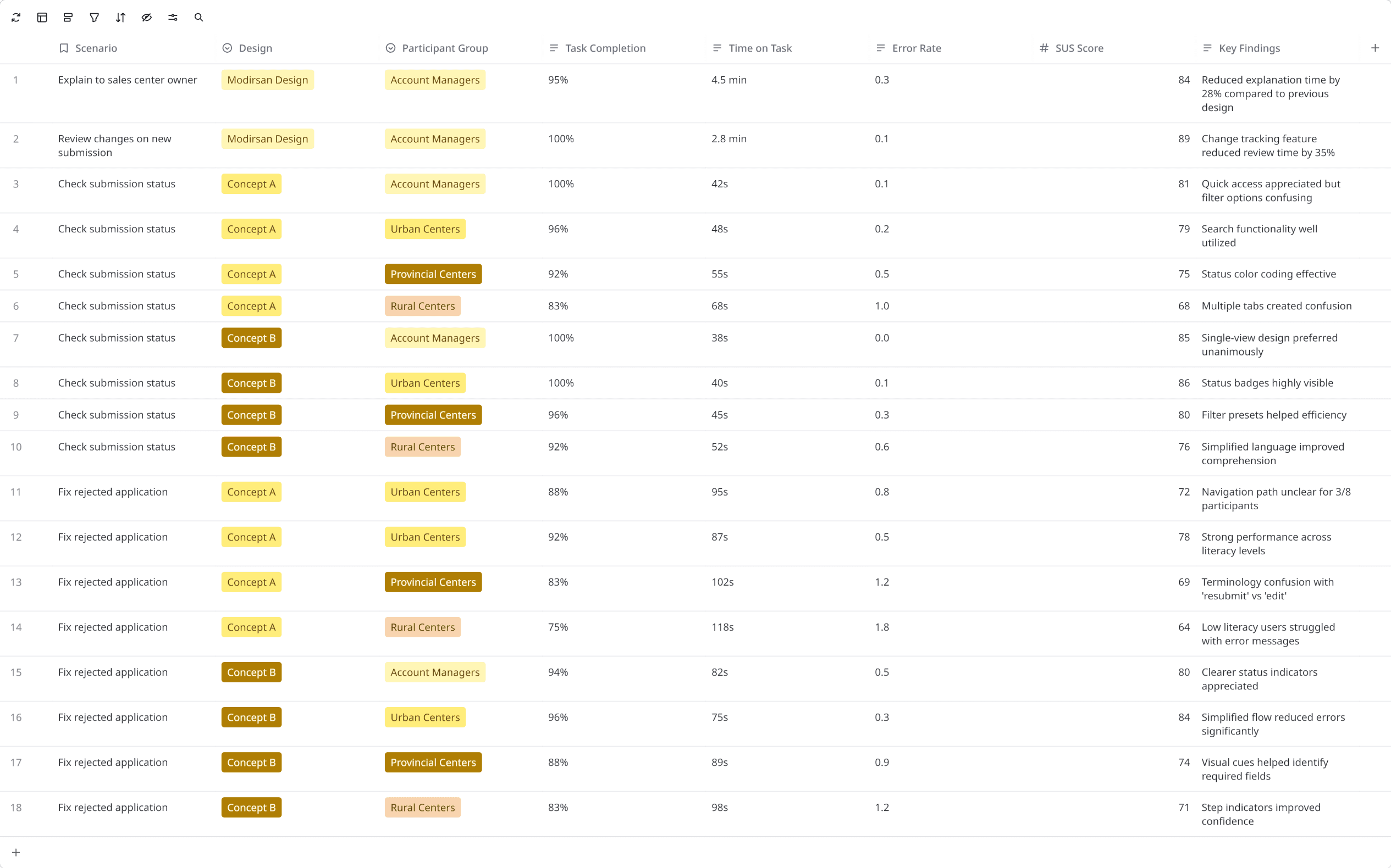
(This table has been edited to remove participants’ name, location, and responsibility.)
What We Learned
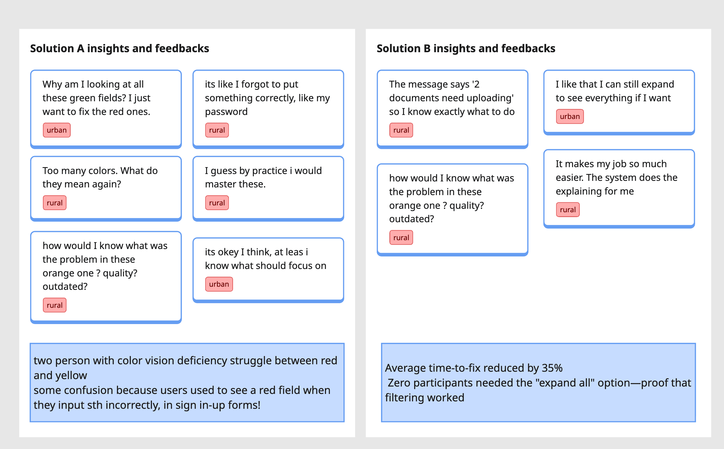
One mistake and one suprise!
The Mistake
As we were working on the various aspects of the redesign projects across multiple products (Modirsan and MCI Club) and another team on the Design System (creating an RTL version of MUI), we completely forgot to implement comment functionality in Modirsan! During testing, we were representing the designs for sales center account managers, and the second participant looked into my eyes and asked, “They can see my notes and comments for the input, but where should I write them?” Can you imagine? We had completely forgotten to design this feature for account managers.
The Suprise
As we were gathering information and insights from our users and account managers, some mentioned I wich I could see what i have changed in full before submission! ( I mean this is our synthesis among various comments but all pointing to the same thing). And, they were right, it was awsome to show them what they have done; one last time to check all the fields at one look! So, after we diced on final solution,we implement what we have designed for account managers, for sales centers too!
The Winner: Progressive Disclosure with Transparency
Solution B won decisively because it:
Reduced cognitive load for all user types
Made status immediately understandable
Enabled account managers to provide clearer guidance
Scaled across the literacy spectrum
Reduced time-to-completion
The refinement: Based on feedback, we added a summary card at the top: "2 fields need your attention (MCI Review)" or "All approved by MCI - awaiting government review"
This gave users instant orientation before showing any form fields.
THE FINAL SOLUTION
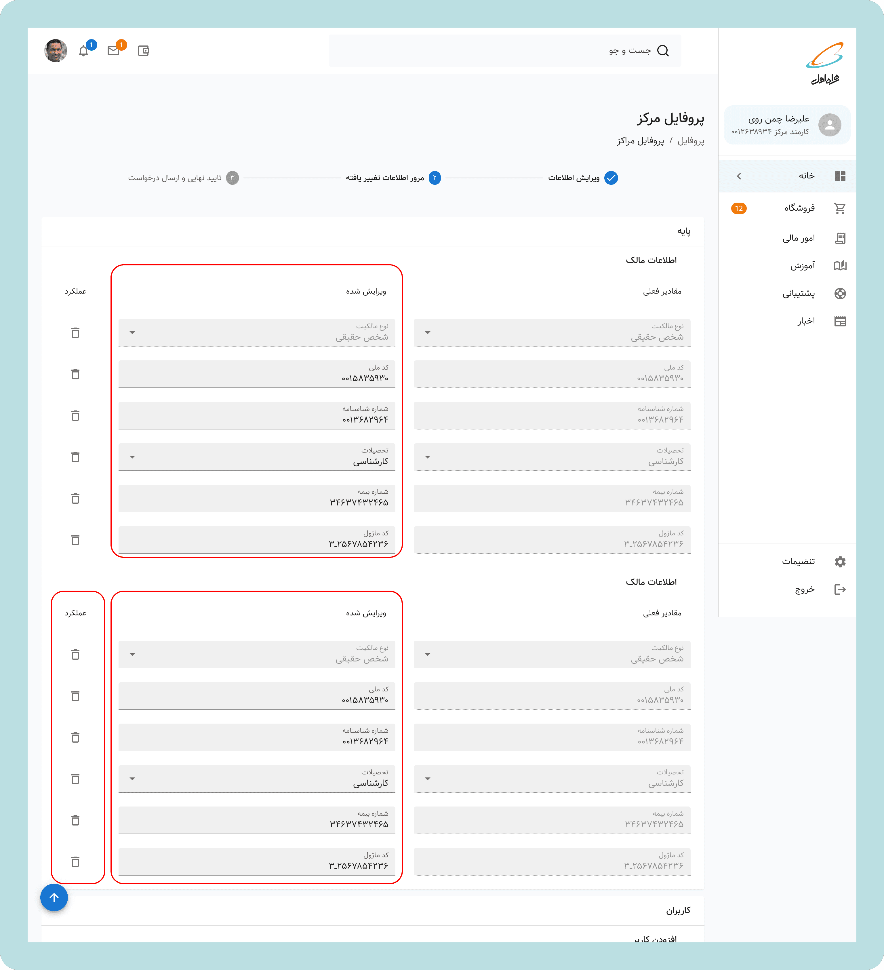
A System That Communicates for Itself
The Registration & Update Flow Redesigned
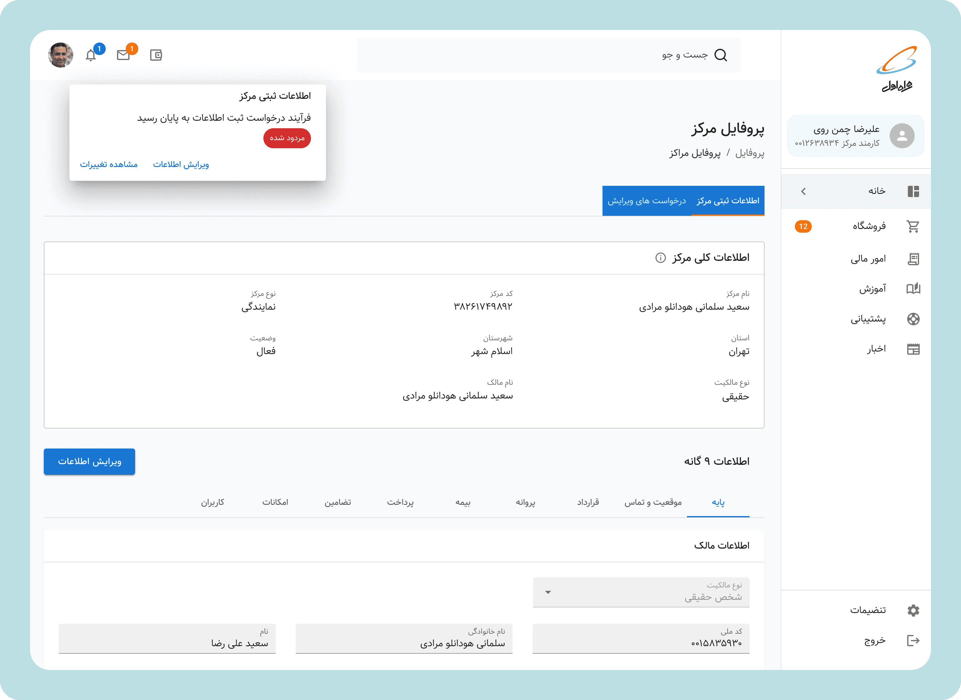
1. Status Dashboard
When a sales center owner logs in, they see a dashboard focused on action, not information:
Status card: Clear language about the current state
"Your application needs 3 updates" | "Under review - no action needed" | "Approved!"Progress indicator: Visual stepper showing: Submission → MCI Review → Government Review → Approved
Action button: Only appears when action is required
2. Focused Action View
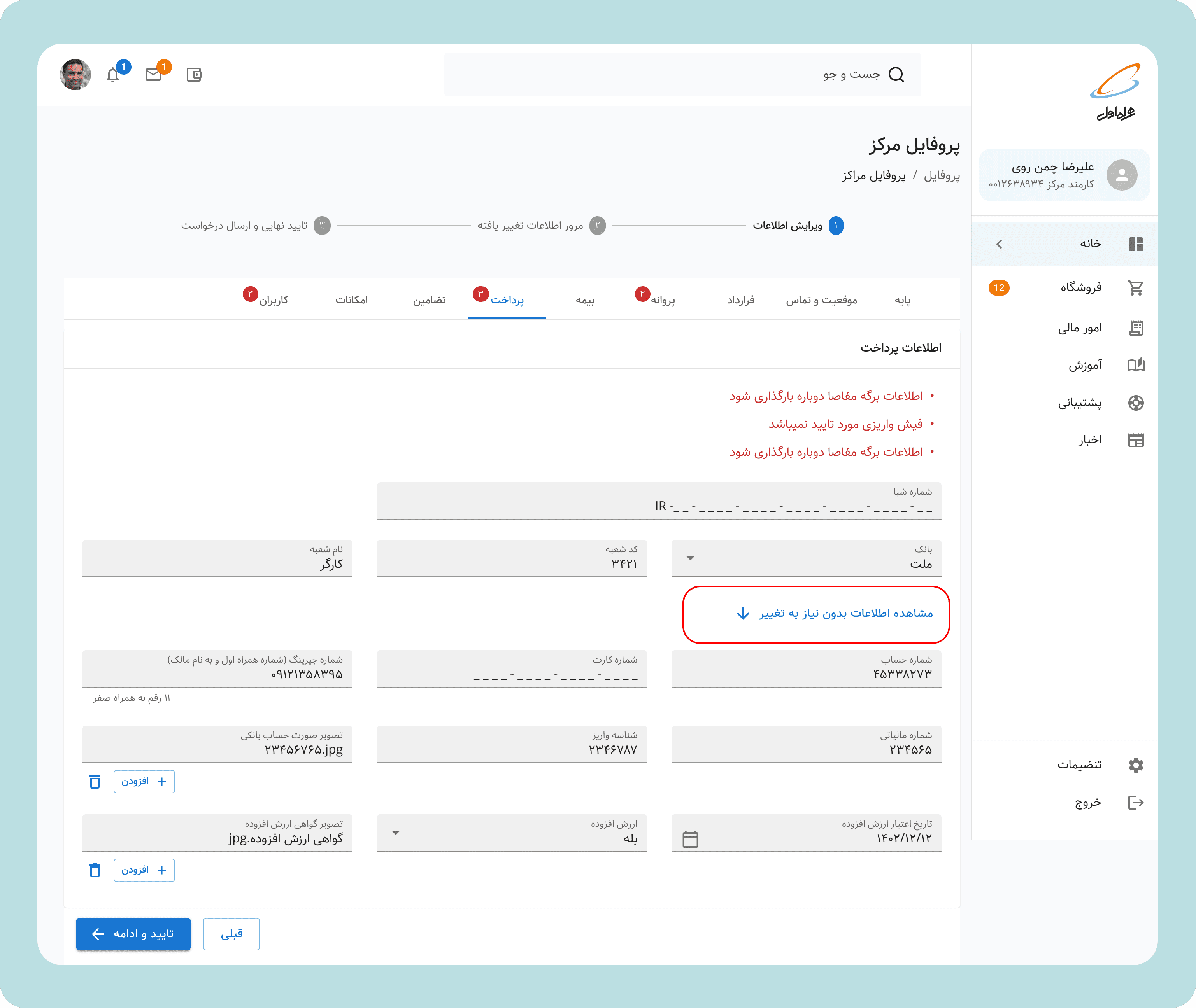
When action is required, users see:
Summary: "3 fields need attention"
Filtered form: Only shows sections with issues, collapsed approved sections
Field-level guidance:
Clear labels: "Business License" → "Business License (Missing)"
Helpful descriptions: "Upload your provincial business operating license (PDF or JPG, max 5MB)"
Why it's needed: "Required for government compliance check"
Inline feedback: Shows what was wrong (if rejected) "Government center notes: License expired. Please upload renewed version."
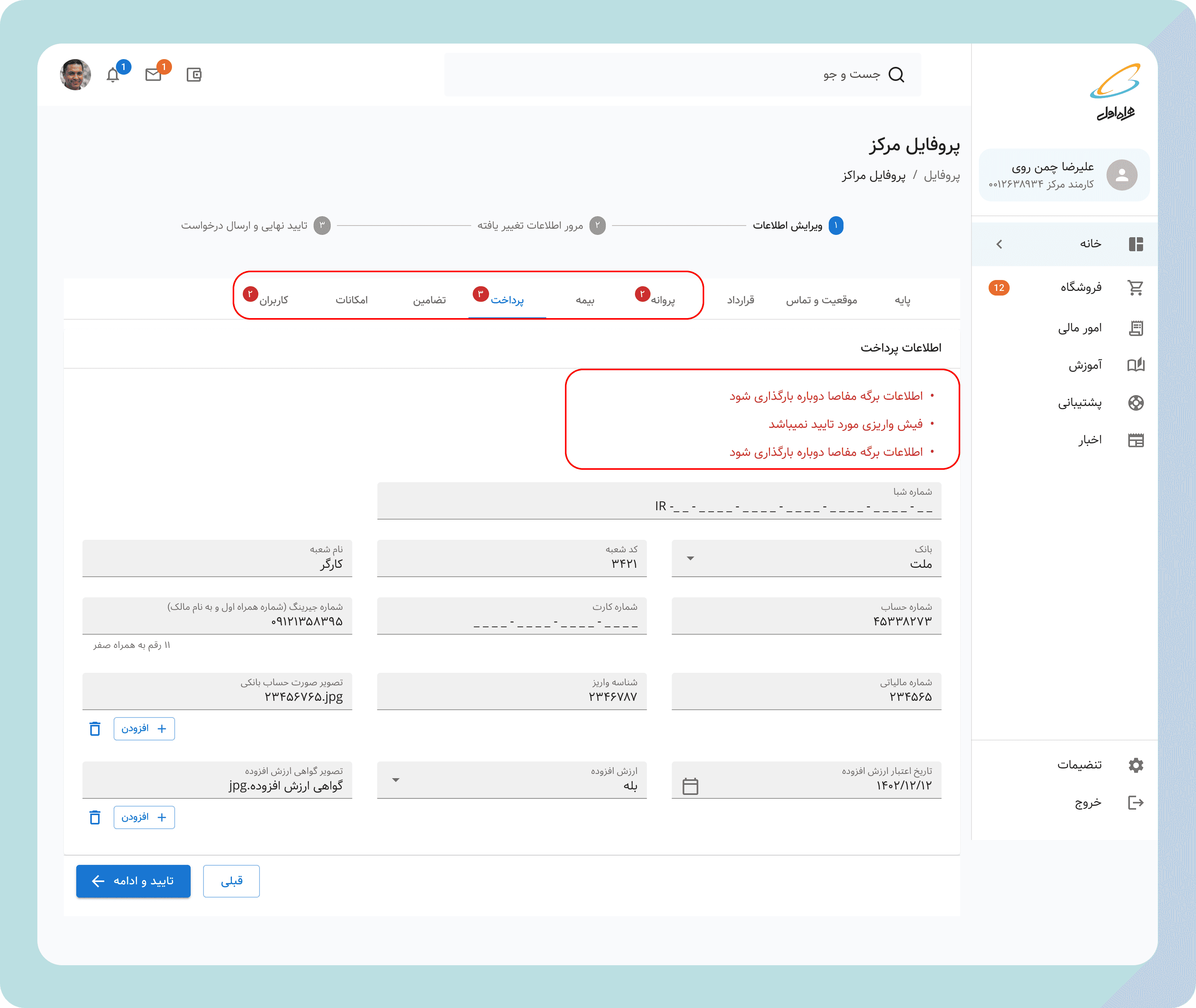
3. Transparency Controls
Users who want to see everything can:
Click "View all fields" to expand approved sections
See submission history and timestamps( through the dashboard submission history/change request)
4. Smart Notifications
Replaced generic "Your application status changed" with:
Actionable: "3 fields need your attention in your sales center application."
Informative: "Your application has been approved by MCI and sent to Government Telecom for final revie.w"
Reassuring: "Your application is under review. No action needed. Typical review time: 7-10 days"

5. Bonus Feature: Quick Recap Step
As test revealed, having a recap feature would help sales centers to review what was wrong and what informormation they are providing for a new review submission. Also with action button they can delete the change they have made, or just edit the field directly if anything is wrong
For Account Managers: A Transformed Tool
The redesign didn't just help sales centers—it transformed the account manager experience:
Before:
Call comes in: "What's wrong with my application?"
Open system, scroll through entire 50-field form
Try to identify rejected fields (red text? error icon? unclear)
Manually explain over phone
Follow-up call when user doesn't understand
Repeat 100x per day
After:
Call comes in: "What's wrong with my application?"
"Log into MCI Club. You'll see exactly what needs fixing—the system shows only those fields. Each one explains what's needed."
(For most calls) Call ends. User handles it independently.
(For rural/low-literacy calls) Account manager opens same view, walks through the changed fields
and yes! this time we also included the "explanation note" button so they can directly communicate the changes needed for the sales center
TECHNICAL IMPLEMENTATION NOTES
Design System Alignment
While I led this workflow redesign, I simultaneously oversaw a team of 2 designers building a new design system( expantion of MUI to support RTL language components, including custom components accomodating design requirements) for all of MCI Club. Key components I ensured were included:
Status indicators: Standardized visual language for system states
Progressive disclosure patterns: Reusable components for show/hide content
Form field states: Consistent styling for validation, errors, success
Notification components: Templates for different notification types
This dual role (product design + design system oversight) ensured the solution could scale beyond just registration workflows to all of MCI Club.
LAUNCH & IMPACT
Phased Rollout
Month 1: Beta with 10 sales centers and 5 account managers
Month 2: Full rollout to all centers nationwide
we asked our BI team to create a dashboard for us so we can clearly communicate and monitor KPIs and success rates.
Quantitative Impact
Call Volume Reduction:
2 months post-launch: 37% reduction in calls to account managers
4 months post-launch: 56% reduction in calls to account managers
Time Savings:
Account managers saved an estimated 15-20 hours per week on registration-related calls
Sales centers reduced time-to-resubmit by 60% (from 4 days avg to 1.5 days)
Approval Timeline:
Average approval time dropped from 30 days to 18 days (40% improvement)
First-submission approval rate increased by 28%
Qualitative Impact
Account Manager Feedback: "I can actually focus on complex problems now instead of explaining the same thing 50 times a day."
"Sales centers trust the system now. They don't need me to translate anymore."
Sales Center Feedback (Urban): "I wish all government systems were this clear. Finally, something that respects my time."
Sales Center Feedback (Rural): "I was scared of computers before. Now I can do this myself without driving to the city for help."
Business Impact:
Account managers reassigned saved time to proactive support (helping centers optimize their operations rather than just troubleshooting)
Reduced escalations to management by 40%
Improved MCI-sales center relationship satisfaction scores

REFLECTIONS & LEARNINGS
What Worked
1. Fighting for Understanding
Getting stakeholder buy-in for 3 months of discovery before designing wasn't easy. The pressure was to "just start fixing things." But we made the case that designing without understanding would waste months building wrong solutions. That upfront investment—the IA mapping, the field research—became the foundation for everything that followed.
2. Designing for the Edges
By designing for the most constrained users first, we created a solution that worked for everyone. Urban users got simplicity and speed. Rural users got accessibility and guidance.
3. Making the Invisible Visible
The workshops where teams saw their interdependencies for the first time transformed the project. Design isn't just about interfaces—it's about revealing systems and building shared understanding.
4. Dual Role as Leverage
Leading product design while overseeing the design system meant we could ensure consistency and scalability from day one. Components built for this workflow were reused across MCI Club, multiplying impact.
What Was Challenging
1. Defending the Discovery Investment
Three months of research before designing anything required continuous advocacy. We had to show early findings, demonstrate uncovered complexity, and explain why rushing would waste implementation resources. Strategic patience requires constant justification.
2. Stakeholder Alignment Across Silos
Eight different departments, eight different priorities, KPIs, and political agendas. The key was showing how the redesign helped all of them, not just one.
3. Balancing Inclusivity with Power User Needs
Urban users initially felt the simplified interface was "dumbing things down." Progressive disclosure doesn't mean removing features—it means organizing them intelligently. The "expand all" option satisfied power users while protecting the default experience.
4. Working in a Semi-Governmental Context
MCI operates at the intersection of private enterprise and government bureaucracy. Every design decision had compliance, legal, and political considerations. I learned to navigate these by involving legal/compliance teams early and framing designs as "enabling compliance" rather than "changing process."
5. Measuring Impact in a Non-Analytics-Mature Organization
MCI didn't have sophisticated analytics infrastructure. Proving impact required creative measurement: call logs, manual time studies, surveys. I learned to design measurement into the solution (e.g., tracking how often users expanded "view all fields").
What I'd Do Differently
1. Start Smaller to Learn Faster
While the comprehensive IA work was necessary, I could have run a smaller pilot (just registration flow) earlier to validate assumptions before redesigning the entire system. Iterative > Big Bang.
2. Involve Developers Earlier in Design
I brought developers in during high-fidelity design. In hindsight, involving them during wireframing could have surfaced technical constraints that influenced decisions. We had to make a few compromises late in the process that could have been avoided.
3. Create More Video Artifacts
Most of my handoff was static documentation. Given the complexity, walkthrough videos showing interaction flows and edge cases would have reduced implementation questions and ensured higher fidelity to the design intent.
What's Next
This registration workflow was just one of many in MCI Club. The success here created momentum and buy-in for tackling other problematic workflows:
Next priority workflows:
Order & inventory management (high call volume)
Financial reconciliation (error-prone, time-consuming)
Employee onboarding (currently manual, should be automated)
Broader vision:
Extend the design system across all MCI digital products
Build a notification center that consolidates updates across all workflows
Create role-based dashboards that surface the most relevant information for each user type
The registration redesign proved that clarity at scale is possible—even in complex, multi-stakeholder, semi-governmental contexts. The framework is now replicable.
CLOSING THOUGHTS
Complexity is Not an Excuse for Confusion
When I started this project, many stakeholders believed MCI Club's complexity was inevitable. "It's a complicated business, so the interface has to be complicated."
I rejected that premise. Complexity is a fact. Confusion is a design choice.
By investing in understanding, collaborating across silos, and designing with empathy for the full spectrum of users, we proved that enterprise tools can be clear, efficient, and even delightful.
The 56% reduction in support calls wasn't just an efficiency gain—it was a dignity gain. Sales center owners in rural villages can now do business with Iran's largest telecom without feeling intimidated. Account managers can focus on meaningful work instead of being human routers. Government liaisons have clarity instead of chaos.
That's what product design at scale should do: make the complex simple, the opaque transparent, and the frustrating functional.
